Hello and welcome to how to draw a donut on cecelyv.com! In this how-to-draw tutorial, we’ll discuss and demonstrate how to make a tasty donut drawing and learn about the shapes, forms, and variations of a donut.
If you’re familiar with any of my other how-to-draw articles–like how to draw a snake or how to draw a mushroom–then you know I like to emphasize form andstructure. I’ll cover the basic shapes and forms that help us create a donut drawing, and I’ll explain the distinction between the donut itself and its delicious topping details.
First things first, let’s make sure we understand what we’re drawing a bit more.
Let’s learn about donuts!
A donut (also spelled “doughnut”) is a sweet treat food made from leavened fried dough. Donuts are popular, yummy to taste, and have a world full of variety, with just about every country and culture, from A to Z, having its version.
Donuts are most often deep-fried from a flour dough, with the two most common types of donuts being the ring donut and the filled donut. The ring donut has a circle shape with a hole cut out of the center, and filled donuts are injected with fruit jelly, cream, custard, or other delectable fillings.
Donut toppings vary wildly, from icing and glaze to sprinkles, frosting, chocolate, powdered sugar, cinnamon, and fruit. The hole from the center of a ring donut is often cooked as a donut hole.
Other shapes include twists, balls, buns, and thick and flattened small loaves. Donuts are also divided into cake and yeast-risen types and can be purchased everywhere, from grocery stores to cafes to donut shops and gas station convenience stores.
The History of Donuts
A cookbook published in 1485 gives us the first mention of fried dough cakes (as far as we know), so donuts have been around for quite some time. If you’d like to learn more about the history of the donut, here are a few sources to check out:
We like to eat them, and we’re making donut drawings, so we might as well look at how donuts are made, right? It’ll give us another good visual and insight for our drawings, and that’s always a good thing ??.
Time to make some donut drawings!
Okay! You’re probably like, “Finally, she gets to the point!” ??
I know it can seem like a lot of extra stuff, but how can we draw what we don’t understand?
Now, let’s learn how to draw a donut and have some fun!
Exploration and study: Donut drawing shapes and forms
We know enough about donuts and their variations to make some drawings, so let’s start with reference boards and sketches!
If you need help making your reference board, I have an article and a video to help.
Donut reference boards help us sketch!
By studying references, we can develop a good idea of the basic shapes and forms as we begin making sketches and drawings. I like to do this for each of my drawing tutorials. Shapes and forms give us structure, and structure is vital.
How to draw a donut – My exploration and study sketches
It’s essential to do all the study sketches you feel necessary to be comfortable with your subject.
Donuts have relatively simple structures, so most of the drawing work is in the details of toppings like coloring, glaze, icing, sprinkles, shadows, and light, whether you put it on a drawing of a plate or with fruit in the middle, etc.
Here are my study sketches from my how to draw a donut explorations:
Exploration sketches based on ref search
Compared with study sketches in my other tutorials, this one is pretty light on drawings–and that’s okay. If the subject is simple, it is easier to understand and draw.
Shape breakouts and variations
A complete picture of the most common donut shapes.
By studying my reference boards, I delivered the outlines and edges of an entire list of common donut varieties for us to draw. These outlines and shapes give us the basis for the forms we need as we learn how to draw a donut, and the form provides us with the structure we need so the delicious icing, glaze, and coloring have something to live on top of in our donut drawing.
Next, let’s have some fun with forms by tackling the form construction for each of these shape outlines.
How to draw a donut: basic form construction
To learn how to draw a donut, I started with the most common and recognizable type–the ring donut.
For beginners, I recommend starting with the most basic shapes and forms. Starting from simple shapes will help you grasp each edge, oval, circle, and line as you make your sketch.
This approach works for everyone from kids to hobbyists and professionals and can be applied to any medium from pencil and paper to crayons, colored pencils, or a digital format. Of course, if you need to trace at first to get started, that’s okay too!
Let’s have fun with donut forms!
Basic donut form construction visual tutorial
How to draw a donut – more form construction!
I mentioned earlier that I identified more than one example of common donut shapes. Whether there’s a wavy line, curved lines, or straight lines, each shape gives us an example of how to start building our donut drawing forms.
It’s essential to my mission to emphasize form and structure in all of my drawing tutorials, so I created visual form construction examples for several of the common donut types to help you learn how to draw a donut of any style you choose.
To practice these form construction steps and learn how to draw a donut in different ways, follow the visual form construction steps below!
When in doubt, remember to lead by drawing an entire shape, like an ellipse, circle, oval, etc. It serves us better than individual lines or edges when we have a whole shape.
filled donut drawingForm construction visual tutorial for a filled donutTwist donut drawingTwist type form construction visual tutorial
The twist type is less round than a basic/traditional donut, so I start with a box shape to capture its overall soft boxy form.
churro type donut/pastryNote the waves on the ends that create textureChurro type form construction visual tutorial
The churro is very tubular in its construction, essentially made of one long cylinder.
A circle on the bottom plane helps place objects and find the centeradditional rectangular planes help define top formsThe different colored pencil allows me to see the round top forms better as I sketch Cake type form construction visual tutorial
Learning how to draw a donut that is a cake type is a little more complex, but we can handle it! The cake types tend to be the ones with more complex top forms and toppings, so it makes sense that their form construction is a little more involved.
How to draw a donut step-by-step tutorial (from my sketches & Imagination!)
Next up in how to draw a donut, I will go through the “official” step-by-step tutorial for drawing a basic ring-type donut.
What you saw earlier with all the form construction was essentially a collection of visual step-by-step tutorials. I wanted to make sure I shared multiple ways of how to draw a donut with you so you can choose for yourself which type of donut you want to create.
Follow along with me, and you’ll have a realistic donut picture, complete with a slight indication of shadows. I won’t delve too deeply into the shadows and light or details in this tutorial because that crosses into the realm of painting and rendering, and we need a solid drawing to paint on top of first ?.
This step-by-step should work for kids, too. So let’s get to it!
How to draw a donut, Step 1
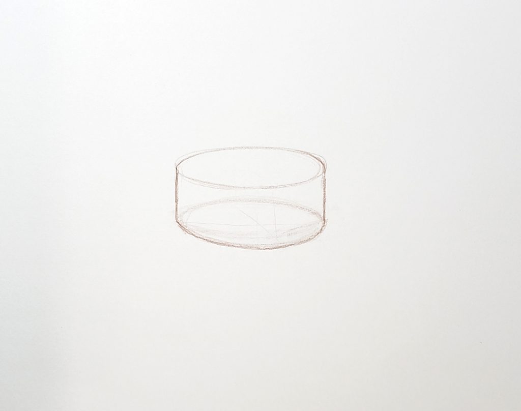
Start with a horizontal oval, also called an ellipse. Extend two lines straight down from each end of your oval.
Step 2
Connect the straight lines you extended with another oval/ellipse.
You’ve created the form for your donut hole!
Step 3
Now that we have the empty middle of the donut, it’s time to construct the ring donut itself.
Add two large circles on the horizontal ends of the donut hole form you finished in step 2. Make the circles as large and as round as you’d like.
Step 4
Connect the outside bottom edges of the circles with a large ellipse as shown.
This creates the bottom plane of your donut.
Step 5
Draw another ellipse to connect the outside top edges of the circles. This creates the top plane of your donut where all the toppings will live.
Step 6
Now, it’s time to erase some of your construction lines to prepare for the next stage of drawing some tasty toppings.
It helps to emphasize the inside edge closest to you in your drawing. When drawn next to your donut hole, it adds a sense of depth and three-dimensionality.
Step 7
Sketch in some ellipses around the ring of your donut to help you visualize how the form turns.
This will give you a guide to help make your toppings look more realistic.
Step 8
Sketch in the basic shape, size, and directionality of your toppings.
I chose a simple icing with light sprinkles, so here I blocked that in here with a different colored pencil.
Step 9
To make room for the detail shapes and forms, I took some time to erase my construction lines more carefully.
Step 10
I continued the detail phase’s block-in step here by adding the shapes and forms of each sprinkle.
I made the sprinkles out of tiny circles, 3D curls, and itty bitty cylinders. They may be small, but they still have form and mass!
I also added a little bit of color to the bottom of the donut. Using brown, I decided to make this a chocolate donut with icing and sprinkles on top!
Step 11
To make the drawing clear, and to keep from accidentally erasing my work during clean-up of my construction lines, I went ahead and did a trace of everything in black marker.
Step 12
The last step is color, shadow, and light!
I didn’t want this how to draw a donut tutorial to turn into a painting tutorial, so I didn’t do much with the light or shadows.
Still a slight indication of shadows under the icing is enough for our purposes here.
Congratulations! You’ve completed my how to draw a donut step-by-step tutorial!
The Details and coloring of donuts
Now you know all about how to draw a donut!
I want to offer a little more clarity on what constitutes “details,” so I created a short video to explain (COMING SOON!)
A warm farewell with encouragement
Thank you for visiting my site!
I hope you enjoyed my how to draw a donut tutorial, and I hope you had fun making donut drawings with me!
Remember, it doesn’t matter how many times you need to erase, or whether you need to trace or start again on a new piece of paper several times. It doesn’t matter if your donut drawing is round or if the donut hole you drew is a little wobbly. Learn the process, find your way of drawing. Keep at it! Art isn’t about being “good”, it’s about how making art makes you feel.
Try this with crayons and other media, try it with kids–or other kids if you are a kid!
Have fun and keep drawing! The rest will come.
If you enjoyed my how to draw a donut tutorial, please share it! I’d love to hear your feedback, so if you have a comment or question for me please leave it in the comments section below! If you didn’t like my how to draw a donut tutorial, please tell me that, too! Part of my site mission is to help as many other artists as I can with my content, so I’m open to feedback that helps my content improve.
Welcome to my how to draw a circle drawing tutorial!
Hi and Happy drawing to you all! ?
Welcome to my how to draw a circle article!
The first thing to know about a circle is that it’s a tool. Each of the two-dimensional shape tools and lines we learn to recognize and draw as kiddos are the foundation for all other forms, patterns, and designs.
In my Understanding Form in Art article, I go into this concept of shapes and lines as building blocks a bit more.
The most common building blocks for everything we draw are the circle, the square and rectangle, and lines. Most other shapes can be created from these base shapes, similar to how each color can be mixed with the base colors of red, yellow, and blue. The only elements simpler than any of the base shapes are the line and the point (or dot).
Without getting too technical, let’s explore what a circle really is.
Let’s learn about circles!
A circle is a shape whose points are all equally distant from the center.
When points are not equally distant from the center point, you will get something different. This is where we find the main difference between a circle and its team of similarly round shapes: the oval and the ellipse.
Circles have been a known shape since before the start of recorded history, and the study of circles in mathematics helped the development of other disciplines such as geometry, astronomy, and calculus. Thankfully, we don’t need to get into the weeds of circumference, diameter, radius, distance, etc in order to draw circles.
Now, let’s look at some examples of natural and man-made circles.
Exploration and study: Natural & Man-made Circles.
A circle is an easy thing to find. Here are a couple of reference boards I created to demonstrate how prolific circles are in our lives.
Natural circlesCircles of the human world
Shape breakouts and natural variations (ovals and ellipses!)
Normally at this stage of my how to draw articles I like to cover the explorative study sketches I create, and break out all the naturally occurring variations in shape and form, but…that’s not really a thing with circles ?.
The ways of how to draw a circle are so simple and subtle, and a slight change to any point on a circle brings you into different shape territory. So, let’s all agree that you guys don’t need me to break down or dissect an already simple shape ?. We’ll just agree, as the intelligent and sensible people we are, that circles are circles, and when you stretch them out a bit they become ovals and ellipses.
How to draw a circle step-by-step: Several methods and tutorials
There are several different methods for how to draw a circle. There are a few that I don’t find terribly practical, such as the paper clip, string, and compass methods. Nevertheless, I’ve created or found an example for each method to offer you a variety to choose from.
PSA for this article: I am not teaching you how to draw a perfect circle. Why? Because it’s not practical or necessary. If perfect circles are your goal…this probably isn’t the best drawing tutorial for you. The wonderful search services of Google will get you to content all about ways to draw a perfect circle, but I’m not the one–sorry ?.
Okay, moving right along! Let’s get into my how to draw a circle tutorials! I have come up with several methods of my own, and I will cover a few of the others I’ve come across (like the string, paper clip, compass, and rubber band methods). Each of the methods that I came up with emphasizes how to draw a circle freehand.
In my humble opinion, when you’re sketching and pulling out ideas, it’s cumbersome to need an additional tool for simple shapes. Plus, a sketch isn’t meant to be perfect; it’s a vehicle for your expression and problem solving.
I will now jump off my soapbox and list the methods I’ll be covering for how to draw a circle.
Methods for How to draw a circle
Square method
Crosshairs or ‘X’ method
Parallel lines method (my favorite!)
Shapes method
String and paper clip methods, and more!
Rubber band method
Compass method
Rectangle method (for ovals & ellipses)
The Square Method
The square is pretty straightforward and freehand. We use a square as a bounding box to help us learn how to draw a circle. Here are some step-by-step visuals for this learning project.
Square Method, Step 1
Draw a square as your first step. I like to find the middle point on each side of the square and mark it with a line or a spot/dot because it’s helpful in the following steps.
Step 2
Next, begin drawing your circle by connecting those middle points with curving lines/arches, as shown.
Step 3
Once you’re happy with your circle, begin darkening it.
Step 4
Lastly, erase your square leaving only your completed circle.
The Crosshairs or ‘X’ Method
Using crosshairs (like a plus ‘+’) or an ‘X’ to practice how to draw a circle is another super simple method, and it also allows you to vary the size of the circle as much as you like–and still draw freehand!
Crosshairs or ‘X’ Method, Step 1
Begin by drawing a simple plus sign (‘+’) or ‘X’.
Step 2
Next, begin connecting the end points of your ‘+’ or ‘X’ using curved lines/arches.
Step 3
Continue connecting the end points.
Step 4
Complete your circle by connecting the last end point.
Step 5
Erase your crosshairs or ‘X’, leaving your completed circle.
The Parallel Lines Method (my favorite!)
This method is my favorite for line work and circle/ellipse drawing practice. The parallel lines offer just enough support while leaving plenty of freedom for practice and experimentation.
The Parallel Lines Method, Step 1
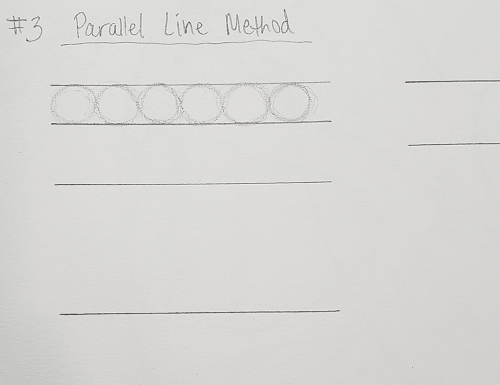
Begin by drawing a series of straight parallel lines with a ruler, as shown. Varying the distance between the lines helps you practice drawing circles, ovals, and ellipses of different sizes.
Step 2
The parallel lines act as guides for placement of the top and bottom of your circles/ovals/ellipses.
Staying within the lines, freehand draw as many circles/ovals/ellipses as you can fit onto each line, as shown.
Step 3
Fill up all your parallel lines with circles, ellipses, and/or ovals. This is excellent line work practice, and a great warm-up exercise.
Here are a few videos to help make this how to draw a circle method more clear:
Using my trained right hand ??. A ruler works, but any straight edge will do.
Using my mostly untrained LEFT hand, Eek!
If you have any questions, please leave them in the comments section below or in the comments section of any of my videos!
Shapes method
This is essentially the same concept as the square method. The point is to use your chosen shape as a bounding “box” from which to create your circle. Shapes create a contained space, so most of them lend themselves quite well to circle drawing. The simplest to use are the square and the triangle, but other shapes can be used just as well.
The Shapes Method, Step 1
Draw any shape to create a bounding “box”. Here, I’ve used triangles and trapezoids. It helps to mark the midpoints of each side on all the shapes.
Step 2
Using curving lines/arches, connect the midpoints of each side.
Step 3
Erase your shape bounding “boxes”, leaving only your completed circles.
String & Paper clip methods, and more!
I found a helpful YouTube video from DaveHax that demonstrates several examples of how to draw a circle, so I’ll share it here:
Rubber band method
Here’s a YouTube video from DrawingWithDeeArtist on how to draw a circle using the rubber band method. The idea behind all these “hacks” for drawing circles is to get perfect circles, not freehand circles.
Compass method
This next YouTube video comes from Lorri at Sunshine22854. In it, she’s kind enough to cover how to draw a circle using a compass.
Rectangle method (for ovals & ellipses)
Once again we’re utilizing the bounding box concept for how to draw a circle–we’re just using a longer box to create ovals and ellipses instead of circles.
Rectangle Method, Step 1
Draw rectangles of any width and length you’d like, and mark the center point of each side (or at the corners for angled ellipses).
Step 2
Connect your sight marks with curving lines/arches, as shown.
Step 3
Darken your lines once you’ve achieved the oval/ellipse you want. Here, I also used this method to create a tear drop shape.
Step 4
Erase your bounding boxes, leaving your completed oval/ellipse.
Drawing circles in Perspective
Learning how to draw a circle in perspective involves first learning how to draw planes and boxes in perspective. In this next video, I’ll demonstrate how I set up boxes in 1-point perspective and draw circles on the planes of each box.
Since circles are flat shapes, the process for drawing them in perspective doesn’t change, even when the perspective changes.
Drawing a circle from Imagination!
Drawing circles as part of your line exercises or warm-up is important training that is beneficial to do regularly. Then there are times we just need fun and interesting–and there’re other ways of practicing how to draw a circle.
In these last couple of videos, I demonstrate a few simple ways of practicing circle drawing by adding depth to transform circles into forms/objects, and by dissecting some forms built from simple ellipses and circles.
Thank you!
Thanks for hanging in there with me! I’m sure you came across lots of choices in your search, and I appreciate being the author whose content you chose.
I hope I’ve been able to do my part to help you see another side to drawing circles, and I hope my article has helped your art journey.
I’d love to hear from you, so if you have any feedback or questions for me please leave them in the comments section below. I hope we can meet each other again for another “how to draw” article!
In this how-to-draw, we’re talking about how to draw a snake!
At first glance, snakes look pretty simple. They don’t have the most complex shapes and forms in their anatomy, but there’s plenty of drawing excitement within the snake species’ natural variations.
To learn how to draw a snake, I’ll share some image references and go through my exploration and study sketching process to demonstrate how studying snake shapes, forms, and anatomy helps you create your own awesome snake drawings.
Next, I’ll cover how to draw a snake step by step, followed by drawing snakes in perspective. Then, we’ll use our references to explore the color and detail varieties in the snake species before sketching some snakes from imagination.
This will be a lot of fun, so I hope you’ll follow along and enjoy learning how to draw a snake with me!
Let’s learn about snakes!
We’ve all seen a snake at some point, right? They’re long, limbless, and covered in scales. They come in a staggering number of color and pattern combinations, and there are about 3,000 species of snakes! Snakes can eat prey much larger than their heads, allowing them to swallow their food whole–unless they’re venomous, in which case it’s fangs out first!
Snakes are found on every continent except Antarctica, and sea snakes are a real thing. ? Yikes!
Thankfully, most snakes possessing venom use it to kill or subdue prey rather than for biting us when we unwittingly scare them, and most snakes aren’t venomous, which is a relief. The nonvenomous snakes swallow their prey alive or squeeze it to death. ?
We’re bigger than snakes…mostly…so, I think we’re okay. I hope ?.
Snakes generally have a negative reputation, but they are wild animals with very sharp fangs and dangerous venom, sooo…I’m gonna say their reputation is deserved.
Still, there is a lot more we can learn about snakes, but for learning how to draw a snake we need to study its shapes, forms, and variations.
Regardless of their hunting and eating habits, snakes are pretty cool and gnarly looking, which makes them fun to draw! Let’s get into our references and start exploring how to draw a snake.
Image reference boards
Each curved line, point, shape, and form we practice in our exploration and study phase adds to our own personal tutorial for learning how to make snake drawings. So, our first step must be to gather references.
I created several reference boards to deliver the information needed to complete your snake drawing. Below you’ll find visual information that will inform you of each step, line, and curve that we need and where they all go proportionally.
You’re welcome to use the reference boards I made, but I encourage you to practice making your own as well. Out of respect, and due to copyright protection, all the references I create for my tutorials are limited to what I can find for free commercial & creative use, create myself, or purchase (which isn’t really a thing on a shoestring budget ?).
In keeping with best practices, let’s begin with the largest shapes and forms, which, in most cases, means studying the main body of our subject first.
Here in how to draw a snake, we begin with the snake’s body:
Snake body references 02Snake body references 01Snake body references 03Snake body references 04
Looking at each reference image of a snake body, what are the first things you notice?
The first things I observe are the curved lines of the body, the forked tongue, the mouth and jaw, the body forms and lines, and the extremely wide variation in coloring, patterns, and head shapes.
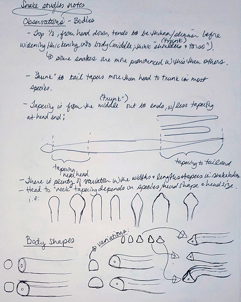
A snake’s body is a simple, tapering cylinder. The way the width, length, and scales vary from head to tail and across snake species is what adds interest, variation, and complexity to the body design.
If you’d like a deeper dive into forms and forms and shapes, check out my Form in Art article. This variation linking across the world of snakes gives us lots of fun shapes to use in snake drawing.
Next, let’s continue learning how to draw a snake by taking a look at the second-largest shape/form on a snake: its head.
The head shape, scales, and patterning of a snake hold nearly all the creature’s design interest and variation. In this how to draw a snake tutorial, I’ve intentionally focused more on the head because a snake’s head offers more room to play and invent than its body.
Knowing where most of a subject’s interest lies helps our design. When you make a snake drawing, you’ll know from your study that the head is where you ought to put most of your shape and form details to draw your audience’s attention.
Snake skeleton
A snake’s head and skull give us clues about how its mouth opens and closes, the shape and direction of its scales, and its size. A snake skeleton reference image is useful and necessary in this area.
Snake skeleton anatomy
Even a brief study of snake anatomy is very useful for constructing realistic, chilling snake head designs. Understanding a bit about a snake’s bone structure helps us ground our snake drawing in reality by connecting the dots between design and believability–and the same can be said about snake fangs, underbelly, and tails.
More snake shapes and forms: fangs, belly, and tail
If we look closely, we can see that snakes often have a completely different look and feel to their belly scales. The departure from the look of the rest of the scales is important to note before you work out the scales part of your design.
It might seem like I’m trying to spam you with each reference image, but studying and exploring from reference and from life will ultimately benefit your snake drawing immensely.
Exploration and study: Snake drawing focused on shape and form
Once you’ve gathered all your references, it’s time to draw from them.
Eventually, you’ll establish your own version of this study and exploration process. I will take you through mine to offer a springboard, so to speak.
Snake head studies
As I mentioned earlier, the head of the snake holds most of the shape and form information. So, for this how to draw a snake tutorial, I decided to focus my studies on the head–especially since the body of a snake is quite easy in comparison (at least, until you get to the scales ?).
Notice that each study includes not only a sketch of the snake head I was referring to on my boards, but also a rough sketch of the overall shape/form envelope. By understanding the larger forms that create and support the head, it becomes much easier to build smaller forms like eyes, horns, scales, etc on top.
Shape breakouts and natural variations
Once I felt comfortable with my understanding of the basic anatomical forms of a snake, I was able to break out the most common natural variations. I complete this step in each tutorial because when we understand what we’re drawing we can draw it much better, and invent from imagination more easily.
Basic snake body shapes
How to draw a snake: body form construction
Even though a snake’s body is a simple tapering cylinder, it’s important to practice all the basic forms of our subject and try to understand its variations.
As shown in my shapes breakout sketches, there are some slight natural variations in the cylindrical form of snakes. As I was working out how to draw a snake body, I kept those variations in mind and tried to have some fun with it as well.
Here are a few of my sketches for the snake’s body forms:
Step 1 – gesture lineStep 2 – shape guidesStep 3 – more guidesStep 4 – create form through shape connectionStep 5 – clean up line work
The example above should help clarify the process of how to draw a snake body. Even though it’s a simple form, clarification on construction always helps.
Step 1 – gesture line and guidesStep 2 – draw shapes within guidesStep 3 – create form through shape connectionStep 4 – light form contouringStep 5 – clean up line work
The process for both of these examples was exactly the same. The only difference was my use of different shape language. This second example of how to draw a snake body offers more of a sense of design and detail, and I achieved that simply by tweaking the overall shape used to create the body’s form.
This is something you can do in your design as well, so have fun with it! Try some sharper shapes for a more aggressive-looking snake, or softer ones for a cute-looking snake.
It helps to put your sketches side-by-side for comparison to see how the altered shape language changes your design.
Compare the slight visual differences between construction shapes.
How to draw a snake step-by-step tutorial
Now that we’ve explored each shape and visual bit, we’re snake ready to draw! A bit of an odd turn of phrase, I know, but I had to give it a try. Okay, next up here in how to draw a snake we’ll dive into drawing a snake step by step.
To be clear, this is my own imagination and it’s a finished sketch not a rendered image. I encourage you to follow the process explained within each step. It is not necessary for your snake step by step drawing to look like mine. This how to draw a snake tutorial is for you, so draw your way. Do you and enjoy!
Drawing a snake step 1
I started with a gesture line to define the snake’s pose.
A gesture line gives us a starting-off point by essentially offering us two dots or points for the start and end/top and bottom of our subject.
It’s also a long curve, with a second curve at the end for the tapering tail.
Drawing a snake step 2
After placing the gesture line to indicate the pose, I began building the shapes and forms for the head.
My selection for each line, form, and curve of the head is informed by the lines I remember from my study sketches.
Before you start roughing in the head, decide on its basic shape. It will be most helpful if you drew from your studies and reference boards.
Drawing a snake step 3
In this step, I began filling out the body form.
My goal in this step was to roughly match the thickness and length of the body to the head forms I’d created.
It’s okay if it’s not quite right immediately. Remember, it’s a sketch to get your ideas out. As you’ll see, I made some adjustments further along in my process.
Drawing a snake step 4
In this step, I decided I need to elongate the main body. The length and detail in the head I’d created needed balancing, so I made adjustments to the body.
I decided not to show the tongue, but I had fun giving my snake a ridge-like nose.
I also continued refining the head forms in this step.
Drawing a snake step 5
This step is about continuing to develop all the forms we drew.
As you can see, there are plenty of places where I erased and redrew my lines to make adjustments and changes.
Remember, it’s a sketch which is basically like a workout–you’re working out the design, the shapes, forms, lines, curves, etc. If you’re not happy with it, start another sketch and keep going!
Drawing a snake step 6
When I reached the point that I was happy with how I’d developed all my forms, I completed my sketch by darkening my final line work.
I do this last step to help make the sketch more readable online, but it’s not a necessary part of the how to draw a snake process.
Snake drawing in Perspective
When we learn how to draw a snake, we need to know how to put it into any perspective our image or story needs.
Next, you’ll find a video covering the process of how to draw a snake in one-point perspective.
The most commonly used perspectives for drawing are one and two-point perspectives, so up next in how to draw a snake I’ll go over the two-point perspective process.
The Details and colors of snakes
While each line and curve helps us define our forms, the world of snakes is very well known for several other features–especially their scales, forked tongue, and patterns.
The scales and patterns are designs unto themselves and so a bit too much to add to this how to draw a snake article (we’re almost done, I promise!). I’ll create a separate article all about drawing scales and designing patterns, but we can still talk a bit about the commonalities in these areas.
Snake scales
Collectively, snake scales are known as snakeskin. Scales serve a variety of functions, which I explore in my article How to draw scales.
The range of variety in scales is amazing, going from these:
snake scales reference board
…all the way to this:
By Herpetoeditor – Own work, CC BY-SA 4.0, https://commons.wikimedia.org/w/index.php?curid=97114387
The image above is from a Dragon Snake. Isn’t that one of the most gnarly things you’ve ever seen?! It impressed me anyway ?. This volume of possibility, and the fact that far more creatures than snakes have scales, means I need to treat How to draw Scales as its own thing.
Pattern search
As I was learning how to draw a snake, I did a research overview of their patterning, and, oh boy! Lots of variation, but without any particular rhyme or reason beyond identifying snake species. This is helpful for us because it means you can design your snake’s skin any way you want ??.
Color search
A lot of scientific pigmentation language is involved with explaining snake coloring, and you can find one source for that here. For our how to draw a snake tutorial, we don’t need the science. Snakes present with just about every color there is along with iridescence, so choose whatever color scheme suits you.
How to draw a snake from Imagination!
Process: Curved lines, shape, form, and drawing through
I mentioned earlier that I chose to focus on snake heads for my demos, so what I have next is a video showing the entire process of me drawing a snake’s head from my imagination. It’s not a cute snake or a particularly good design, but that wasn’t the point ?. The point was to share my thought, creative, and imaginative process with you.
A warm farewell and finishing touches
Congratulations! You drew some fun snakes today! I hope you feel good about the new knowledge and practice you drew from this article.
Snakes really are pretty simple to draw in a basic sense, and I hope this how to draw a snake tutorial helped you with your snake-drawing goals.
I’m always happy to hear from my readers, so pretty please leave your questions and comments for me below. I’d love to hear what you think about this article and answer any questions that may have come up for you.
Welcome to another article in my how-to-draw series. This article is all about palm trees and how to draw them! If you want to add more beach and “fun in the sun” feel to the ocean and sand of your art, draw palm trees! A simple palm tree, coconuts, and some tropical fruit can create moods for your drawing that say “vacation and Mai Tais” or “building sandcastles with the kids.”
As you go through this article, you may notice that I’ve changed my format a little bit this time by leaving out the lighting (shadow and light) part. I’ll clarify that choice toward the end here, but, first, let’s focus on learning how to draw a palm tree!
Once you learn to draw a palm tree with all its parts and detail–from the silhouette to the curved lines of the tree trunk, and the round crown to a palm tree’s leaves–you can render your finished drawing however you choose: realistic, cartoon, anime. You’ll be covered by what you learn how to draw here!
First, we explore and study all the shapes and forms that make a palm tree look like a palm tree. Then, we’ll start constructing the basic shapes and forms, move into practicing with palm tree silhouettes, dig into some step-by-step palm tree drawing tutorials, and draw a palm tree in perspective.
I’ll cover the basic shapes, forms, & silhouettes of palm trees and all their parts, including the palm tree trunk and palm tree leaf. Our first step is the same as always: references!
Canary Islands Date PalmCanary Islands Date PalmAreca palmBismarckia nobilis palmAdonidia palmChamaedorea elegans palmDypsis decaryi palmEuropean fan palmFoxtail palmRavenala Madagascariensis palmRhapis excelsa palm
Let’s learn about palm trees!
Palms, including palm trees, are from the family Arecaceae. They are a family of flowering plants with several growth forms, all commonly known as palms.
Most palm species, characterized by large evergreen leaves called fronds, are found in tropical and subtropical environments.
As one of the best known and most cultivated plant families, palms show extensive diversity in physical characteristics that allow them to inhabit nearly every kind of habitat. Being so well cultivated means palms, from their wood to their fruits, have several uses in human society, including palm wood, carnauba wax, palm syrup, dates, oils, jelly, and coconut products.
Exploration and study: Discovering a palm tree’s basic shape
Study sketches help us build our design process. In this step, we must take the time to understand the “thing” we’re drawing. Without this step–or without spending enough time with this step–drawings and designs will likely fall flat.
Since we’re not interested in polishing turds, let’s learn about the shapes and forms that make a palm tree!
Shape breakouts and natural variations
Palm trees have fairly basic overall shapes. To begin an amazing palm tree drawing, choose a few simple shapes and forms.
palm tree shape drawings, outline
I started outlining the basic shape breakdowns first because it communicates our goal in this step more clearly. However, it’s important to note that exploration doesn’t start with the shape breakdown sketch you see above; it starts with a messy and thorough exploration of your subject with all its parts and variations.
Here are my exploration study sketches:
palm tree drawings: trunk lines, center, edgespalm leaves, palm leaf drawings, leaf tip, edgesleaf details, leaf connection to frond, leaf lines and tip, realistic leafpalm leaves, palm leaf tip, leaves, center, middle, extra leavespalm leaves, circles, outline, extra leavesleaf lines, middle, edges, outline
First, I explored all the parts of the palm tree: palm leaves, the palm tree trunk, the different directions of the fronds, and individual leaf construction information for several types of palm leaves.
The challenge and complexity arise when it’s time to draw all the details and textures–a lot of small and irregular shape details– that give palm trees that recognizable feel and character.
My hope and encouragement for you are that you don’t forget or skip the exploration drawings stage before jumping straight into the palm tree step by step tutorials coming up.
Trust me, your step-by-step practice will level up much further the more you study palm trees through sketching exploration.
How to draw a palm tree: form construction
Completing our palm tree exploration sketches gave us a decent grasp of the parts of the palm tree. We have a solid idea of the lines, outline, silhouette, and edges that we need to create our own palm tree drawing.
Our study into how to draw a palm tree allowed us to wrap our minds around where we need to be drawing curved lines vs. horizontal lines or a straight line and showed us which basic shapes and forms we have to work with.
As we continue to learn how to draw a palm tree, let’s jump into practicing the tree’s form construction.
The bulk of form construction on a palm tree lies in drawing the trunk while drawing a palm leaf–called a frond–calls for drawing slightly curved planes without much volume apart from the palm frond base.
Most of the trunk is a simple long cylinder, but the portion at the top that resembles a fat cylindrical drum (and sits between the leaves and the trunk) has much more volume and thickness from the forms of dozens and dozens of pruned/shaved fronds.
palm tree trunk cylinder construction – gesture linespalm tree trunk cylinder construction – middle steppalm tree trunk – cylinder form final step
Looking up palm tree drawings or palm trees on Google images gives the impression that most palm trees are just long and skinny with a few floppy fronds and a sprinkling of coconuts. This impression is mostly true of young palm trees or palm trees that have been more heavily pruned through shaving.
To learn how to draw a palm tree, I took a look at how trees get that shaved, skinnier look:
Here’s what I see around my neighborhood:
how to draw a palm treeSo much texture!Real palm tree in my neighborhood
The point I’m trying to make here is: Always do your research and then find the best references you can because a basic search will only get you what everyone else has drawn, and that’s never the whole story of all that’s available for your designs.
Palm tree silhouette
I mentioned at beginning of this tutorial that I’d changed my format a bit for this article, and here’s why:
When you start exploring palm tree drawing (or any tree…or hair…or fur…really any highly textured thing, you get the idea ???), it quickly becomes clear that drawing the leaves of a palm tree one at a time is a huge pain in the butt!
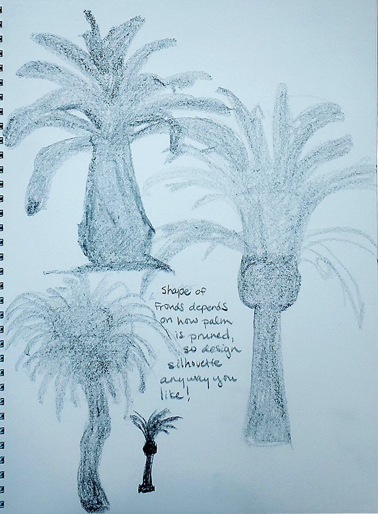
The studies alone that I drew showed me the last thing I wanted to do was draw the fronds one at a time. So, when the shapes are small or many and squished or layered, what tip can we use to save us pulling out our hair? Introducing, Silhouettes!
How to draw a palm tree with silhouette, step-by-step tutorial
There isn’t one right way to draw silhouettes. What I’m showing below is only one way to approach it. Please approach this in the most intuitive way for your drawing process.
Start with a shape for the trunkAdd the drum/bellend shapeCreate the gesture lines for the frondsOverlay the frond shapes on top of the gesture lineshow to draw a palm tree silhouette
Here are a few I drew by hand during my exploration stage.
palm tree trunk, silhouettes, trunks, shade in pencil.Palm tree drawing, silhouettes, trunks in pencil.
Drawing with silhouettes helps us visualize our overall subject and its gesture without allowing us to get bogged down in details.
Since most of what we see of trees is their general silhouette and light effects on their shapes and forms (small shapes make textures!), using silhouettes to draw palm trees gets us further along without all the hair-pulling ?.
Once we’ve experimented with a few silhouettes (they should totally be messy, not precious at this stage!) and chosen what we like, we can flesh out the internal shape and form information by drawing over our palm tree silhouette.
Palm tree silhouette draw over, step by step
Lower silhouette opacityBegin laying in shape and form linesContinue line workAdd interior shapes and linesBegin line cleanupFinal line drawing
To do this digitally as I have:
Create a new layer over your silhouette and fill it completely with white, and then lower its opacity until you can clearly see your palm tree drawing silhouette enough to draw and trace over it.
Create another new layer on top of your white trace layer and begin sketching the internal shape information over the top of your silhouette, including texture information.
Use as many layers as you’d like to experiment with as many interior shape designs as you can. Simply hide the layers of your other design iterations to help you focus on the current layer’s work.
If you started traditionally on paper, you can also complete this step by photographing/scanning your drawing for your base palm tree drawing layer and then follow the steps above.
To do this traditionally:
Get some tracing paper and overlay it onto your drawing.
Begin sketching the internal shape information over your drawing onto the tracing paper. I recommend using pencils for this so you can easily make changes as you sketch. It’s also fun and useful to have multiple pieces of tracing paper for trying different interior shape designs.
A light box, if you have one available, is also a useful tool for this step when you’re working traditionally. Here are a couple of options from Blick & Amazon.
I found this to be one of the most interesting and enjoyable steps for how to draw a palm tree, and I encourage you to work loosely and have a blast with it.
Easy steps palm tree drawing
Now, we come to the how to draw a palm tree step by step parts of this tutorial. This is the easiest version of this tutorial. I plan to create a more advanced and involved version in the future.
Step 1
Since the planes and lines of a palm tree can get overwhelming quickly, I break the drawing process down into lots of digestible steps.
First, choose the simple shapes you want for your leaves and trunk and create a simple silhouette as shown here.
If you want to add some fruits, like coconuts, now is a good time to add their shapes as well.
Step 2
Next, we begin to construct the forms from our thumbnail.
Here I drew the middle “drum-like” part that sits between the fronds and the trunk.
Step 3
Draw the long trunk attached to the “drum-like” part.
Step 4
Draw the overall container or “envelope” shape you want for the palm tree leaves. This step helps you begin blocking in the gesture and direction of your leaves.
Step 5
Overlay the palm leaf gesture lines onto your envelope shape. This gesture line step helps you place the tree’s leaves in the position and direction you want them.
Step 6
On top of the gesture lines from the last step, draw your leaf shapes.
Step 7
Begin adding texture details to your leaves by using lines to “cut” into the edges/contours of each leaf.
Step 8
Next, I added simplified oval shapes to represent the shaved/pruned fronds on the “drum-like” part of the tree.
More texture adds to the palm tree feel of the drawing.
Step 9
Almost done!
Before cleanup, add some texture to the trunk.
The highly textured feel of a palm tree trunk comes from lots of frond leaves that were pruned/shaved as the tree grew.
Final Step
Once you clean up your lines and edges, erasing where there is some overlap of shapes and lines you don’t need, you’ll be all done!
Palm tree drawing in Perspective
Knowing how to draw a palm tree in perspective is useful for placing your trees in any scene you want. Below is a quick visual demo for drawing palm trees in two-point perspective.
Set up horizon line, vanishing points, and boxesPlace palm trunk and frond gesture lines within boxesBe sure to follow the perspective line guides
Color and light and palm trees
I know there’s a lot more to cover to help you understand how to add color and light to a palm tree, but that’s a whole other discussion trust me. I will write another article to cover the color and light area on its own so it’s not confusing ?.
In the meantime, if you’d like to add some light to your tree, please try out my Fundamentals of Light article. It will help you get started with the basics of light and shadow in art.
More details and coloring of palm trees
Without getting into the weeds too much, I thought it would be useful to do a quick visual once over of the textural details palm trees possess.
Here you’ll get an idea of the other textures and some very useful references for your drawing! For quick color experiments, I recommend using colored pencils or pastels.
FULL DISCLOSURE: I do not own these images! I found them on Google Images under the “Creative and Commons” usage rights filter.
Palm tree trunk dissection reference
Palm tree trunk texture reference
Palm fruit reference
Frond Coconuts Coconut Tree Palm Phoenix Dactylifera Dates Palm Fruits Date Palm
Fond wishes and a warm farewell until next time!
I hope you found this to be one of those easy drawing tutorials, and I hope the art and explanations here have helped you digest the more difficult aspects of how to draw palm trees.
Thank you for spending part of your day with me learning how to draw a palm tree! I appreciate you stopping by, and I’d love to hear your feedback. If you have any questions or ideas for improving this article, please leave them for me in the comments below.
Happy drawing, everyone! I hope you’re all doing well and ready to learn how to draw a cube with me today ? .
Cubes are one of the five basic forms. Drawing cubes freehand and in perspective are important skills to build on your art journey. Every form you need, for anything you want to draw, can be carved out of or built from a cube.
I’ll be demonstrating a few different methods for cube drawing here with step-by-step images and videos. I’ll show you how to draw a cube freehand, as well as cube drawing in perspective.
Learning how to draw a cube is simple and straightforward. It gets challenging when you need to turn them in perspective, but that’s a bridge to cross later ?. For now, let’s take a look at what cubes are.
Let’s learn about cubes!
The most helpful description I found of a cube comes from a website search on Kiddle:
“A cube is a block with all right angles and whose height, width and depth are all the same. A cube is one of the simplest mathematical shapes in space.”
https://kids.kiddle.co/Cube
The main thing to understand is that a cube is a three-dimensional shape, meaning it has Volume. While a square has width and height, it has no depth–no volume. A cube, and all other three-dimensional forms, have width, height, and depth.
The sides of a cube (also called faces) are squares. Each side is connected to the others by straight lines (called edges) and by corners (called vertices). Each of a cube’s corners is at a right angle. A cube has 6 faces, 12 edges, and 8 corners.
If you’re interested in a more mathematical explanation of what a cube is, you can find it here.
You might have heard people refer to all kinds of boxes as 3D cubes, especially when they’re talking about drawing in perspective. Technically, not all boxes are cubes, but for drawing purposes, it really doesn’t matter one way or the other ?.
Exploration and study: Natural and man-made cubes
Interestingly, there aren’t a lot of examples of naturally occurring cubes. Since it’s such a basic visual building block, I thought that was a little surprising, but ??♀️. Naturally occurring cubes are found primarily in rock, mineral, and crystal formations, and it’s super easy to find examples of man-made cubes in almost anything.
Here are a couple of reference boards I created to illustrate both natural and man-made cubes.
Natural 3D cubesMan-made 3D cubes
Shape breakouts and natural variations
Normally, I would make a bunch of exploration and study sketches of my subject and break out all the different shape and form variations. But…cubes are pretty simple, so that’s not really a thing for this drawing tutorial ?.
The shapes on a cube are just squares, and the variation is limited: we’re either drawing a cube or a rectangular “cube” (box). When we learn how to draw a cube, those are our base options. But simple is good, right?
Okay, let’s dig into this how to draw a cube business. I’ll go over a few freehand methods I came up with, and I’ve included a few video demonstrations about drawing cubes/boxes in perspective and showing the drawing process for the methods.
How to draw a cube step-by-step tutorials
I made up names for the freehand cube drawing methods I came up with ?:
The basic method
Upside-down L’s
The Headless stick figure
Connect the squares method
The basic method
This way of drawing a cube is one that I learned early on in my art journey. It begins with a simple square shape and builds into a cube by adding depth with additional lines.
The basic method, Step One
For the basic method of how to draw a cube, step 1 is drawing a simple square of any size you’d like.
Step Two
Next, start creating depth by drawing lines out from each corner. This begins to give you the edges of the cube.
(I missed the bottom left corner here, but I’m sure you’ll rock it ?).
Step Three
Begin connecting the edges of the cube you drew in the previous step. The goal here is to create each square face of the cube, so each complete connection should give you a square face.
Step Four
Connect the last edges and vertices, and you will have completed your 3D cube.
Upside-down L’s
This is just a spin on the basic method that allows us to shift our thinking a little bit. Instead of starting with a familiar shape, we begin with an upside-down letter ‘L’. This way we start out thinking in terms of edges and vertices rather than shapes and faces.
Upside-down L’s, Step One
As its name suggests, step 1 is drawing two upside-down capital L’s. Their size and how far you space them apart will determine how your cube looks.
Step Two
Connect the two L’s to complete the first face of your cube.
Step Three
From the two bottom vertices of the square face, draw edges back in space that each run parallel to the tops of the original upside-down L’s, as shown.
Step Four
Begin connecting the ends of each of the edges you added in the previous step to create additional faces for your cube.
In this example, the bottom and left faces were created.
Step Five
Finish connecting the last three vertices to create the last three faces of your cube and voila! You now have a completed freehand cube!
The Headless stick figure
This how to draw a cube method is straightforward like the others. We begin with the back corners of the cube and work our way forward in space until the cube is complete, and starting with a headless stick figure gives us that back corner start as you’ll see in this next demo.
Headless stick figure, Step One
We have five edges and two vertices. If we were to add a circle at the top, we’d have a stick figure. Without the head, we get the back corner of our cube.
Step Two
Connect the “arms” and “legs” of our headless stick figure to get the first two planes of our cube, as seen here.
Step Three
Connect the top two outside corners with straight edges to create the top plane of the cube.
Step Four
Drop an edge down from the front-most corner of the top square plane. This sets us up to complete the last three planes of the cube.
Step Five
Connect the two bottom outside corners to the end of the vertical edge you dropped earlier and boom! You have a completed cube ?.
Connect the squares method
The focus of this how to draw a cube method is connecting corresponding points (vertices) of the squares. This way of drawing cubes is a lot of fun and opens up possibilities for more interesting cubes and boxes.
Connect the squares, Step One
Drawn any size square you’d like to begin.
Step Two
Draw a second square with roughly the same dimensions as the first, and consider its position in relation to your first square since you’ll be connecting them.
Here I chose to overlap them slightly to make the connection a little more intuitive.
You’ll notice my second square is a little smaller than my first, and that’s okay. The point is to understand and practice the process.
Step Three
Choose a square corner to start with and connect it to its matching corner on your second square with a straight line (edge).
Step Four
Continue connecting the matching edges of both squares to each other.
Step Five
After connecting the last corner, you’ll have a completed freehand cube drawing!
How to draw a cube medley!
To make this how to draw a cube tutorial more clear, I created a couple of videos to demonstrate the process for each method shown above. Establishing our processes in our work is extremely important, and my goal is to make the processes I use as clear as possible to help you decide on your own.
How to draw a cube: 3D cube drawing.
Cube drawing by connecting squares.
How to draw a cube in Perspective
Perspective can get a little hairy and confusing when you try to explain it with words and images alone, so I think the best approach for this particular art fundamental is a video demonstration.
To be clear, I didn’t make this video to explain drawing in perspective point by point, but the setup and process stay the same whenever you’re drawing basic forms in perspective.
How to draw a cube: 3D cubes in perspective.
You may have noticed from the video that I did the entire demo on a 3-point perspective grid–meaning a three vanishing point setup. For practice like this, it doesn’t matter which perspective you use so long as you have each vanishing point you need. I find it helpful to work from a 3-point perspective grid even when I’m not drawing in that perspective because it gives me the option of drawing in three different perspectives without having to change my paper format.
As long as you use the appropriate vanishing point, or points, for the perspective you intend to use on your object/form, then you’re good to go! ??
How to draw a cube: Form dissection
Normally, at this point, I would go over how to draw a cube with a dissection demonstration that dives into interior forms. However, with basic cubes and boxes, which aren’t representing anything specifically, there aren’t any interior forms to explore.
Still, a demonstration on cutting into/cutting away/dissecting the cube form is still helpful and useful, so that’s what this next video shows.
How to draw a cube: 3D cube dissection.
More cube drawing – building other forms
As I mentioned earlier, all manner of forms can be built from or carved out of cubes and boxes. Here are a few simple examples to demonstrate what I mean:
Freehand forms from cubes.
How to light a cube
Rather than get into an entire discussion on the fundamentals of light, I decided to show a few photographic examples of lighting on a cube. With a few simple art supplies and wooden 3D shapes, I photographed some images to use as a visual tutorial for how light falls on a cube.
This first set of images were taken in my make-shift still life box. It’s an old diaper box whose inside I’ve covered with black butcher paper. I cut out a couple of holes on each of the short sides and partially cut away the top so I can control the lighting. The cube in these images was lit with white light from a spotlight.
Closest to light sourceFurthest from light source.You’ll notice that the shadow gets longer and softer the further the cube is from the light source.
These next set of images demonstrate the light on a cube from my overhead studio light. It’s a small ceiling fan with a light kit, which essentially functions as a large diffused light source for these examples. Once again, you’ll notice that the shadow gets longer as the cube moves further away from the light–however, the shadows (shading) are different with a different light source. There are multiple shadows because the light source is composed of 3 light bulbs.
This gives us multiple shadows that are also brighter and quite soft.
Closest to the overhead diffused light sourceFurthest from the light source.
In this last set of lighting/shading reference images for how to draw a cube, I used a candle–a much smaller, but quite bright, light source–to light the wooden cube. A candle would be a point light source, and it makes for much darker and more crisp shadows.
For some of these, the candle (point light) was low and closer to the cube, while at other times it was positioned above the cube. As usual, the closer the cube is to the light source, the sharper and darker the shadows are.
Closest to the point light source.
Here are a couple of examples of how to light a cube and place the cast shadows using a traditional medium, graphite pencils.
How to draw a cube from Imagination!
Let’s practice how to draw a cube from imagination ?.
There isn’t really much to explain or guide you through here. Just grab a pencil and some paper, and let your imagination fly! I chose to draw some everyday objects to keep things simple and clear, but the sky is the limit with cubes. Go for it!
How to draw a cube from imagination – demo.
Happy cube drawing!
Well, that’s everything I have on how to draw a cube for now.
Thank you so much for hanging in there with me! It’s my goal to write for beginners, students, experienced artists, and hobbyists alike on this walk of art life, so I hope you found the content of my cube drawing tutorial helpful.
I truly appreciate the opportunity to be a guide and participant in your artistic journey, and I hope I’ve helped you make your cube drawing pop! I know you have a lot of options when you search the web, so thank you for spending some time on my little side line of the internet ❤. I hope you enjoy your cube drawing!
I’d love to hear from you, so if you have any feedback or questions for me, please leave them in the comments section below!
I’m not sure many people fully appreciate the nature of what artists attempt to do each time we set out to render light and shadow in art. I know I haven’t, even when I’m in the middle of rendering, and I love light and shadow in art!
As I continue to dig into what light and shadow in art really is, I am awestruck and so thankful to all the scientists and artists who came before me—the giants upon whose shoulders we stand—because the subject of light and shadow in art is huge, and I am glad they already figured all this stuff out for us ?.
It is difficult not to get philosophical here because what we are really doing when we render light and shadow in art is re-creating the properties and behaviors of light in a 2D space—and those behaviors and properties encompass several sub-branches of modern Physics, including: Quantum Physics, Modern Optics, Geometric Optics, and Physical Optics.
Let’s take a moment to appreciate the fact that different aspects of light behavior and properties come under several different categories of Physics that are each quite involved areas all their own.
That was my not-so-subtle warning that The Fundamentals of Light–light and shadow in art– gets quite technical.
The understanding we gain for our art is totally worth it, and we need three things for sure: 1) Patience, 2) Plenty of visual examples, and 3) More than one post to go through the massive amounts of information.
For any of you who are much better scientists than I, please forgive any inaccuracies in my scientific understanding or explanation. I endeavor to be an expert artist, not physicist ? , but I do try to be as accurate and as clear as possible. If I get something wrong, please let me know in the comments and I will do my best to make corrections.
I hope you will hang in there with me as I break down the technical bits (that’s the patience part), I hope the examples and information I share help your practice, and that you’ll find it useful enough to look forward to the future posts in this series. Since this is the first, let’s start digging into to the science of light and shadow in art, shall we?
The Science—What is Light?
To understand how to render light and shadow in art we must grasp the concept of what light is and how it behaves.
Light is a type of energy created by the emission of photons within the electromagnetic spectrum. If that sounded like gobbledygook, fear not, I shall explain.
A photon is a “small bundle” of electromagnetic energy and the basic unit that makes up all light. Thus, photons are the building blocks of light.
Electromagnetic energy describes forms of energy that are reflected or emitted from objects as electrical and magnetic waves that can travel through space. The Electromagnetic Spectrum shown below describes these energies as frequencies and wavelengths.
The light effects we paint represent a fixed and narrow range of the Electromagnetic Spectrum called the Visible spectrum, which is a narrow group of wavelengths between approximately 380 nm (nanometers) and 730 nm.
As illustrated in the diagram above, The Electromagnetic Spectrum contains several other forms of light, however most of them are at frequencies we can feel but not “see”.
All light has both a frequency and a wavelength, and all light can behave as both a particle and a wave depending on the situation. In fact, both light and matter have particle-wave duality in their properties and behavior. It’s important for artists to understand this duality because it affects our thinking and problem solving regarding light at different stages during rendering.
When we begin to invent our images we must also invent our lighting. When we are mentally calculating the direction of our light source, its reflections, and fall off, it is helpful to think of light as particles, or rays, that travel in straight lines.
This helps us figure out how much of our object will be lit, how to place the form shadows and cast shadows, and where the bounce light will land. When objects are opaque, I have found considering light primarily as rays helps me best determine how to render the light.
Visualizing light as raysSunlight rays
When objects are translucent, transparent, or have variable reflectivity, things start to get more complex because light is not simply being absorbed and reflected but also transmitted through the object. Transmission of light through objects gives us more to consider and calculate because it gives us more to paint, like subsurface scattering, refraction, and more reflections.
Let me put your mind at ease and say it is not necessary to do any complex mathematic calculationsto paint these effects, just some additional concepts to understand and visual calculations to make.
Light transmission on skin, a.k.a Subsurface ScatteringSubsurface scattering on leavesLight transmission resulting in reflection & refractionMore reflection & refraction via light transmissionGlass ball reflections…OMG
When we think about reflection, refraction, and absorption, it helps to think of light first as a particle or ray (for determining the light’s intensity, direction, and bounce) and then as a wave—for determining which wavelengths are reflected off, absorbed by, and/or transmitted through the object and the ground.
That was a huge mouthful, I know. I will be going over all of these more nuanced areas in other articles in this series.
Understanding the particle-wave duality of light begins to give us a clear view of how light’s behavior changes as it interacts with different materials. Watching the videos below helped me gain a clearer understanding of this concept, and I hope you find them useful, too.
As we bring together the elements we need to understand, we start to define the contours of The Fundamentals of Light (light and shadow in art) so that we can start filling in details and particulars—and don’t worry, there will be photographic examples and demos so all of this becomes more clear.
Properties of Light & Matter for Artists
I know this has been a little science-heavy so far, and that’s intentional. It is how I make sense of complex topics, and I hope you find it helpful. Now that we’ve covered the basics of what light is, I’ll change things up a bit to keep everything digestible. I’ll cover a little science and do some explaining, and then use photographic examples or demos to clarify how the information helps in creating art.
Next, let’s dig into the properties of light, but first I want to give you a list of all the properties to keep in mind whenever it’s time to render light. This is a list according to me, and they’re based on my experience rendering light in both 2D (Photoshop) and 3D (Maya).
Light Properties
Matter Properties
Number of Sources
Form/Shape
Type of Light(s)
Local Color
Size of Source(s)
Material Type
Distance from object/picture plane
Density
Angle/Height of Source(s)
Reflectivity
Temperature/Color
Transmission
Exposure/Intensity
Refractive Index
Fall Off
Emission
Some of these are straightforward, so let’s talk about those briefly. The number of light sources is an important consideration because we need to know how much light information we’re working with. More light sources in a scene makes for a brighter image, but how each source affects the picture plane depends on all the other properties on the list.
The size and angle/height of each source are also straightforward properties and they ask questions like: Is a light source large, small, or medium? Do several small lights make up one larger source because of how closely grouped they are? Do these sources sit high or low on the picture plane? Are they even visible in the image, or are they shining from somewhere out of frame?
Under properties of matter, shape, form, local color, and material type are the most straightforward. We must know what shapes and forms make up the volume of the objects we’re rendering, and we need to know what color and material type they are. After all, there is quite a difference between painting a shiny chrome ball and painting a shiny colored plastic ball. Sure, they’re both shiny; but one is metal and ridiculously reflective while the other is plastic, softer, and much less reflective.
Metal ball with reflectionsColored plastic balls
The Two Ways Our World is Lit
Despite all the science, properties, and moving parts involved with understanding how objects are lit, there really are only two ways anything receives light in our world: directly or indirectly.
Objects are either lit directly by a light source or indirectly by reflected light when the rays from the source bounce off some surfaces and objects to illuminate others. This kind of indirect lighting is also called Ambient Light and it is much weaker in comparison to direct light. Most lighting schemes will involve both direct and indirect lighting.
Next, we’ll go over the categories that light sources fall into.
Properties of Light – Types of Light Sources
There are 3 types of light sources:
Key Light
Fill Light
Rim Light
Key Light
A key light is the strongest light source in your scene. It defines the emotional impact of the scene and is the primary descriptor of forms and drama. When you decide how to “key” your scene, you are choosing the overall mood and tonal range that will define it.
Dramatic low key lighting.Sunlight as Key Light
Fill Light
A fill light is not as bright as a key light and is often softer and a lot darker. Fill lights support your scene and subjects by adding light and color information in the shadows, which can illuminate an area of interest you wish the viewer to see or just provide added interest or balance to your scene. Fill light can be ambient (reflected) light, as I’ve done in my examples below, or it can come from an additional light source(s).
No fill light.Red reflected fill light.Yellow reflected fill light.Bright, neutral reflected fill light.
Rim Light
A rim light travels the outer edges of objects. Rim light helps define shapes, add dramatic appeal, and can be a helpful tool for adding compositional information and/or emotional impact.
Rim lit femaleRim lit male
No matter what kind of mood a story or scene calls for, any lighting scheme will have at least a key light and, likely, some combination of all three light source types.
Okie dokie, how’re you doing? I know this has been a lot to get through, and I hope you’re still hanging in there with me. Deep breaths, we’ve got this!
Now, it’s time to go over some terminology to help keep things clear as we continue to move through the Fundamentals of Light (light and shadow in art).
Defining Terminology + Sphere Tests
Think of this as the glossary section of this post. Here I’ll define the frequently used terms that will show up quite often from now on in both my writing and the call-outs in demos and examples.
Light Source
Anything that creates and emits light. Light sources can be natural, like the sun, moon, and fire, or artificial, like lamp posts, flashlights, and device screens.
Light Direction & Angle
The orientation of a light source relative to the picture plane. For example, low and out of frame on the left, or mid-level and in frame on the right.
Exposure
The intensity or strength of a light source. A high exposure light source makes for a brighter, “high key” scene, while a lower exposure light will make a scene appear less bright. I tend to use exposure and intensity interchangeably.
Center Light
The area of a form receiving most of the light; the lit side of a form.
Highlight
The brightest area on a form. This is usually a small area that is receiving the most direct light and reflecting a bit of it back.
Half Tone
The area on a form that has begun to turn away from the light source, resulting in a transition area of light to shadow. This area is receiving some light, but not nearly as much as the parts of the form facing the light source more directly.
Reflected/Bounce Light
Light that bounces off a surface and then lands on another form or surface is Reflected or “bounce” light. Reflected light is much weaker than direct light and can occur on any part of a form, except occluded areas.
Terminus/Terminator
The point at which light cannot land on a surface. This is where the shadow side of the form begins.
Shadow Core
The darkest part of the form shadow. The shadow core on a sphere typically looks like a dark band right next to the terminus, a clear separator between the light and shadow. The core shadow is also the part of the form shadow least affected by reflected light.
Form Shadow
The areas of a form that are in complete shadow and receive no direct light.
Occlusion Shadow
Occlusion shadows are the darkest areas in shadows and on/within forms where absolutely no light can reach. When something is occluded it is completely obstructed or blocked, so when light is occluded you have complete darkness.
We see occlusion most often in narrow areas right beneath forms before the cast shadow begins, and with narrow openings, cracks, and crevices of surfaces/forms. Occluded areas are not sufficiently open enough to the environment to receive any light, so there is only shadow.
Cast Shadow
Cast shadows is created when an object’s form blocks light. Objects block light adjacent to themselves and in the shape of their contours. There are three distinct parts to a cast shadow, the Umbra, Penumbra, and Antumbra. Much of the time, in art, we are only painting an umbra and penumbra. When multiple light sources of different intensity and direction/angle are involved, we begin to see examples of all three parts of a cast shadow.
Umbra: Umbra is Latin for “shadow”. The umbra is the innermost and darkest part of a cast shadow, where the light source is completely blocked by the form creating the shadow. [i]
Penumbra: Penumbra is Latin for “nearly” and “almost”. The penumbra is further from the object and lighter than the umbra. Further away from the object light from the source and the environment can influence and brighten the shadows.
Antumbra: The antumbra is the lightest and softest part of a cast shadow. The technical definition is confusing and unnecessary for our purposes, but if you’re curious click here.
Now, I’m going to show a few sphere test examples to visually illustrate the terms above so we can make practical sense of all you’ve been reading.
light and shadow in art, lighting a sphere demo step-by-step.Exposure – NormalUnderexposedOverexposed
The Distance of Light Sources & Why It Matters
Each property of light and shadow in art plays a role in affecting the mood of our scene and the light effects we paint. The appearance and quality of shadows are determined by the light and forms that cast them. How near or distant a light source is to an object has a significant impact on the appearance of an object’s form shadows and cast shadows, so let’s get into that next.
We can group lights into categories based on their characteristics, like size, distance, and how intense they are to get a starting place for how those lights would interact with the objects in our scenes.
Distant light sources are things like sunlight, moonlight, and powerful spotlights like those in stadiums and theaters. Distant lights tend to:
Be neutral lights.
Cause soft-edged form shadows.
Create cast shadows that are the same size and shape as the object because their light rays are parallel.
As one example, we know the sun is a huge, very distant, powerful light source, and from observation we know that light from the sun strongly illuminates everything it reaches. That means light is bouncing around everywhere in our atmosphere and reflecting a lot of light, so we can expect brighter and more colorful shadows when the sun is involved.
Playing with exposure also makes a big difference, so an overcast grey sky lowers the exposure, diffuses the light, and makes the sunlight seem much less energetic than a clear and cloudless sky, and creates lighter, softer, and less colorful shadows.
The Sun is also larger than our Earth, and any object we would light with it, so we must also consider the sun as an “oversized” light, which we’ll get into in a minute.
Nearby light sources are things like lamps, candles, device screens and monitors, lighters, matches, lanterns, etc. Nearby light sources tend to create:
Larger cast shadows because the light rays are no longer parallel.
Shorter and sharper (harder edged) cast shadows the closer they are to objects, longer and softer cast shadows the further they are from objects.
A higher terminus and a larger form shadow.
A more active or energetic feel and added tension to a scene.
When nearby light sources are also quite small (like candlelight or a lighter), they tend to cast hard-edged cast shadows. They present an additional composition challenge because they can become distracting if not handled carefully. Nearby light sources tend to become a focal point in a scene, so it’s important to be mindful of that and use it to your advantage for your chosen lighting scheme and compositional design.
Oversized or Diffuse Light Sources
Examples of oversized or diffuse light sources are the entire sky on an overcast day (sky light), light coming through large windows, and any light that is scattered by being translucently covered or blocked (like a paper lantern, a light sheet or cloth, an umbrella, or frosted glass covering for light bulbs). Oversize or diffuse light sources tend to:
Cause an object’s terminus to move further away from the light source (the larger the light source is larger relative to the object).
Create softer edged shadows.
Make environments and characters feel softer, warmer, and more friendly.
In the case of light sources that are larger than the objects they illuminate, the light rays are travelling out in random directions, reflecting off the atmosphere and other objects and surfaces, and filling in the shadows, which softens them. Shadows become softer edged because light does not reach each part of the shadow area equally, and because the object blocks (occludes) part of the light area behind it.
Diffused Sunlight in ForestDiffused Sunlight in FogDiffused Artificial Light
Ambient Light
Ambient light is created when light from a source is reflected off the ground, other objects, and the environment. It is possible for objects to be exclusively lit by ambient light, but a key light (which is usually a direct kind of light) is still needed to emit the light that will be reflected.
Terms like indirect light, reflected light, and bounce light all mean the same thing: they are all ambient light. Ambient light is most noticeable in shadows because of the contrast, but it is present whenever and wherever reflected light lands on an object or surface.
Light rays lose most of their strength and brightness (90%) with each bounce, and they are bouncing around multiple times. This loss of strength is why ambient light is generally weak and cannot reach into occluded areas.
You may have come across the term ambient occlusion, especially as it relates to lighting in 3D modeling apps like Maya and Zbrush. In drawing and painting, if zero light can reach an area, I simply refer to this as an occlusion shadow or an occluded area.
For a bit more on ambient light and ambient occlusion, here’s a video by Marco Bucci (awesome artist!) that I found helpful.
light and shadow in art, occlusion shadow/ambient occlusion.
Light Direction & Angle: How They Affect A Scene
In any lighting scheme, cast shadows are a compositional and mood element that should be considered and planned. Choosing the light’s direction and angle is an important step in setting the emotional tone of a scene as well as defining forms and helping viewers to understand how to react to what they are seeing. Cast shadows can add drama and mystery to a scene, particularly when the object or character casting the shadow is off-camera.
Different light directions and angles offer a variety of mood options, and I’ve listed a few here:
Direct Overhead Lights:
Tend to read as unnatural.
Can help create tension and drama, and how much depends on the light’s exposure and temperature.
Angled Light from the side:
Defines form.
Reads as active and energetic.
Adds dramatic tension.
Frontal light (slightly to the side and above, not directly in front):
Comfortable way of positioning light.
Keeps an object/character from being in too much shadow.
Good at defining form.
Reads as soft and friendly.
Under Lighting:
Is the most unnatural of all the lighting directions.
Feels dramatic in spooky, creepy, threatening, and unnatural ways.
How you choose to render the light and shadow in art you create will always depend on the position and point of view of the audience, and the message that needs to be conveyed.
Direct Overhead LightAngled Light from SideFrontal LightUnder Lighting
The Fundamentals of Light (Light and Shadow in art)—Breaking Down The Parts
Even though we learn in steps and stages, I find it helpful to get the “lay of the land” because it provides a road map, and it’s nice to at least have some idea of what we’re doing, right? With that in mind, I have listed the major headings that are part of studying The Fundamentals of Light (light and shadow in art) and broken out some detail for the area we’ve covered today.
Deep breath…
Properties of Light
Light Sources
Types of Light
Terminology & Sphere Tests
Fall Off & Form Changes
Exposure
Light & Surface Color
Reflections
Translucence & Transparency (Transmission)
Light & Materials
Atmospheric Effects & Atmospheric Perspective
The Human Experience of Light
Rendering/Visual Styles
Next Time: The Fundamentals of Light, Part 2!
Take a moment to think of your absolute favorite treat for relaxing and pampering yourself. See it, visualize it in your mind’s eye. Now…get yourself that treat! You have just made it through a massive amount of information in a relatively short(ish) amount of time.
Congratulations!
Thank you for hanging in there with me to learn about light and shadow in art! I’ve tried to keep things clear and concise, but I know this was a lot to take in. I commend you, I thank you, and I am sending you virtual high fives and fist bumps!
Congratulations! You got through an intro to light and shadow in art!
We need some forms before we render light and shadow in art, so if you need guidance in that area I have some articles covering Form and The Fundamentals of Art to help.
The next couple of articles in my Fundamentals of Light series will cover exposure and fall off, and then absorption, reflection, and refraction of light wavelengths.
If I’ve confused you or you have questions, or if I’ve gotten anything wrong, please message me in the comments and I’ll do my best to clear things up.
I hope you’ll join me for those as well.
Take care and happy drawing with light and shadow in art everyone!
Welcome fellow artists! Thank you for sharing part of your day with me to talk about art fundamentals ?.
Since you’re here it means you are looking for answers regarding the fundamentals of art and other art concepts like painting, color, composition, anatomy, value, and many others I’m sure. When we start our art journey, we have tons of questions about art and its elements. I’m happy to share everything I have learned as an artist because I remember the struggle of becoming.
There are almost always pre-established paths, curriculum, video courses, books, and other avenues for getting whatever knowledge we seek. These avenues lay out what the essential or fundamental parts are for any discipline and stress the importance of learning those fundamentals to achieve success—and for good reason, as our work and understanding tend to fall flat without them. Everything there is to learn has fundamentals intended to serve as our foundation.
A foundation is our primary source of essential knowledge and skills, and once completely established it supports us as we grow from it and built on it. Have you ever heard the phrase “We stand on the shoulders of giants”? The artists that came before us, from masters to hobbyists, have already laid the groundwork for us. We don’t need to reinvent anything, all we must do is learn the basics, each art concept, and do the work to make our art.
Yes, it is a process. Yes, it does take years. That’s okay! It’s worth it, and so is your art dream.
What are the Fundamentals of Art?
Search for “art fundamentals” or “what are the fundamentals of art?” online and you quickly get a cornucopia of mish-mashed information about art and design.
There is a difference between a fundamental, a principle, and an element. A fundamental is something you start with and then build on. A principal is similar to a fundamental, but it can also be a set or list of things that make up one encompassing fundamental. I think about it this way: if there are multiple principles, then whatever heading they’re all listed under is the actual fundamental.
Take the Principles of Design, for example. There are at least seven of those, but Design is the fundamental. Make sense? An element is literally a component, one part, of a whole. All fundamentals have elements, but no single element is a fundamental on its own.
Why Learn the Fundamentals of Art?
Because you want to draw and paint awesome stuff without tearing out your hair, that’s why.
Making quality art requires us to understand all the fundamentals of art as well as their elements, including painting, color theory, composition, color mixing, anatomy, perspective, design, etc. Understanding each of the fundamentals, each concept, in depth is a process and an investment in ourselves as artists. You have goals as an artist that you dream of meeting, and your journey is about equipping yourself to get where you want to be and rocking it when you arrive. So let’s gear up by going over this list.
My Top 5 Art Fundamentals for Beginners
To be completely honest and transparent, this list represents the top 5 art fundamentals according to me. Others may disagree, but I have been working at this long enough—and I have classically trained enough—to present this list with confidence. The order I list them in is based off years of study, practice, and wall smacking.
Forms
Line
Shapes
Structure (Construction)
Proportion (Illusion of Mass and Dimension)
The Fundamentals of Light (Tones/Values,includes basic Color Theory & Mixing)
Drawing from Life
Gesture Drawing & Anatomy
Perspective
My key reasoning for the order of this art fundamentals list is quite simple: Historically and to this day, most times when I hit a wall it’s in one or more of these five areas that I find the solutions I need. Had I built a stronger background in these earlier on, I would’ve hit fewer snags. The strength of our foundation plays an important role in how we navigate our way through any challenge, and no matter how experienced we become, problem solving and corrections will always be part of our creation process.
It’s good to get different perspectives on things, so here’s the awesome Bobby Chiu on what the fundamentals of art are:
With all that in mind, let’s start digging into these top five fundamentals and help you on your way.
1. Form
When we talk about Form in art, we’re referring to an object’s overall shape, volume, and contours which include line, depth, and mass. Seeing and constructing Forms are the first and most vital skills we must develop as artists. Practicing the analysis, understanding, and building of Forms creates a strong foundation for developing and growing all other fundamental art skills. Line, shape, structure, and proportion are essential building blocks for anything you draw or paint.
The process of practicing each of these skills builds our visual library and the muscle memory needed to allow us to create whatever artwork we want. As artists we are in the business of communicating feelings, thoughts, impressions, messages, and stories, so let’s look at how developing our skill with Forms helps us.
Benefitsof developing skill with Forms
1. We Learn to See
Practicing seeing and creating Forms helps us become familiar with the physical make-up of all the things that surround us and how all their parts come together to shape part of our experience.
2. We Learn to Analyze, Explore, and TakeRisks
We begin to see connections, relationships, repetition, and similarities between and across forms and objects. This readies us to look more closely at each subject and better understand the fundamentals beyond the basics.
When you feel ready for more on Forms, I take a deeper dive into the topic in my UnderstandingForm post.
2. The Fundamentals of Light: A Few Words on a Massive Topic
The study and practice of The Fundamentals of Light allows us to create Tones/Values in our work. Where Forms add the illusion of volume and dimension, light and shadow give objects a sense of mass, help further clarify surface texture and plane changes, explain the objects’ local tone and color, indicate mood, and show objects’ context within the picture plane.
Studying Light teaches us how it interacts with everything in the real world and helps us reproduce an illusion of its effects in two-dimensions. This practice helps us illustrate the properties, mood, and the character of the objects and people we draw and paint. With these two art fundamentals in our toolbox, we can create the illusion of any type of material, choose any level of detail, and guide the story to wherever it needs to be.
The process of practicing with light and shadow in art begins to bring us into other areas, such as color theory, color mixing, color key, light key, and painting. During this learning process, I recommend you to try to keep color simple. While color theory is relatively simple, a deft use of color takes years of practice and there are several elements involved when dealing with it. I also recommend using digital painting tools in addition to traditional painting to help with the study of color.
Digital tools are much more forgiving and are great for practicing and experimenting with value and color. My favorite thing about playing with color and value in a digital painting app, like ProCreate or Photoshop, is that they allow you to learn all the elements of color without having to mix color.
Mixing is its own thing–not a big thing, but still. Painting traditionally involves understanding the characteristics of each product (whether those are painting colors or mediums) and paint colors can vary wildly within a single color range and from brand to brand. Since traditional color mixing is so involved, it is best practiced separately from these five fundamentals.
Practicing each of these art fundamentals requires us to also practice Drawing from Life, which is the next area of fundamental practice I recommend for beginning artists.
3. Drawing from Life: Growing Your Skills & Visual Library
Every time we make art from life, we are doing something very important for our art and for ourselves as artists. We are taking into ourselves the life around us and engaging with it. Sketching and Drawing from Life are how we have a dialogue with the object we are re-creating. The relationship we have with the world through this process develops and maintains our visual libraries.
To begin, I suggest starting small and simple.
Think of the different types of shapes and find objects from your daily life, and from nature, that include many of those shapes. Then, draw them a lot. Start with the basic shapes you see—i.e., circles, squares, triangles, etc.—to practice seeing the elements that come together to construct the forms, such as cylinders, spheres, cubes, boxes, pyramids, cones. Leave out details like the surface designs, textures, and colors for now, focusing only on the forms, local tone, and basic light and shadows.
Draw the objects from different viewpoints, at different times of day, in different positions, under different lighting conditions, on their own, and grouped with other objects. Some printer paper or a simple sketchbook and pencil are really all you need to get started.
Once you feel comfortable with the simple forms, take yourself to the next level of form complexity and alternate between organic and inorganic forms to help to keep things varied, fun, and to keep expanding your visual library. As you become comfortable with more and more complex forms, you will find yourself ready to begin tackling the most challenging ones: Humans and animals.
For an artist, gesture drawing is essential for infusing a sense of motion, energy, and life into our artwork. As artists, we want to share art that feels alive, and gesture drawing and anatomy help achieve that. Gesture helps us add to the observation skills we build when creating from life by teaching us to see, accentuate, and exaggerate the motion in the poses of our subjects.
Every subject has gesture and motion; they are not exclusive only to humans and animals. Even when an object is static, like the trunk of a tree, it still has a gesture—it just doesn’t convey motion because it is not moving. Gesture is an area of study unto itself because creating the illusion of dynamic motion has its own set of terminology and guiding principles.
However, as with the other art fundamentals, gesture drawing builds on the other skills that were listed before it. Just as we construct our objects from lines and shapes, so too do we build our gestures. In a traditional gesture class (usually called Figure Drawing), we learn to identify the line of action for each pose and then build the forms around it. This also involves much practice in seeing, and accurately placing, the angles, proportions and distances between shapes and forms.
It is another form of drawing from life, with the specific life form being a human model.
Figure Drawing for Gesture Practice
At first, working with the figure feels quite daunting and challenging (and hilarious cuz there’s a naked stranger in front of you). I put it this far down on my list because it is a much more demanding skill. Even so, when you feel ready, I strongly encourage you begin adding gesture/figure drawing to your practice routine. It’s as fun as it is challenging, and it will help your hand and eye mature.
When I first started waaaay, back in 2001—OMG I’m totally aging myself—I was like all the rest of my first-time figure drawing artist classmates: giggly and terrible at drawing naked humans. I had no idea what I was doing, and that was fine. At first it’s quite humbling, but with a good instructor (Thank you, Professor Tacang!) I improved. If I can do it, so can you—with all the art fundamentals.
Remember, this is your journey so make it work for you and your art. I am here to act as a helpful guide and faithfully pass on what I learn.
The last skill in this first round of art fundamentals is one that helps pull everything together and adds an extra kick of believability to our creations.
5. Perspective: Exciting and Technical…mostly.
The first four art fundamentals are all about building the solid drawing foundation we need to support us as we work to communicate through our art. Perspective is another powerful tool for our visual storytelling, and it is a bit different from the others. Whereas the other areas of fundamental study are focused on constructing, lighting and enlivening objects, Perspective focuses on the space the objects occupy.
It deals with how the orientation of each object changes depending on its position within that space, and where our point of view is set (POV). Perspective allows us to understand the spaces our objects and stories occupy, and to examine each from different points of view.
Access to any point of view in the story is the gift we gain by developing our skills with Perspective, and the impact of a story can change dramatically depending on the viewpoint from which it is told.
As with the other fundamentals of art, Perspective is an area of study unto itself and has its own set of terminology, rules, and ways of practicing. It is certainly one of the more technical areas of study in art.
Creating objects in perspective is a more guided way of working that calls for a lot of lines and points: horizon line, vanishing points, and construction lines. I think it can be exciting when it helps an idea come to life—but it can also feel dry and ass numbingly dull (or painfully frustrating) depending on where you are with it. Perspective is important to learn, important to understand, and, unfortunately, is also a skill many artists avoid early on. I know I did.
It made my head hurt, so I said “no, thank you”…to the detriment of my artwork. Eventually, I sucked it up and learned better (plus it really, really helps with composition!).
So…What About the Other Art Fundamentals?
Believe me, there is no rush and the five we’ve just gone over will do the vital work of helping you build the foundation all your work rests on. The other art fundamentals: Color & Light, Principles of Design, Composition, and Line & Brushwork…they’re not going anywhere, and I’ll be here to help you make sense of them.
Thank you for hanging in there with me! I hope you have found this article helpful. If you have any questions, feedback, or if I have confused you at all, please let me know in the comments so I can help.
Have you ever flipped through a super thick art supplies catalog and felt surprised at the huge number of drawing tools out there? Have you ever felt confused or overwhelmed at the massive variety of art materials, drawing materials, drawing paper and other surfaces available? Have you asked yourself, “How do I choose drawing tools for beginners? What about quality? Should I go for high-quality, professional quality, or student grade? Can I get what I need for less? Why is there so much product out there?
There are so many different kinds of pencils, paint, eraser, brush, pastels, pens and other materials. How do I pick what is good for me? How will I know? What do I want? It’s all so new…maybe I should go to the art supply store to shop for drawing supplies…
I’ve been there. Let’s dig into this topic and see if we can answer these questions.
I started drawing! Yay! Now what?
Congratulations! You’re on your way and that’s good, so keep drawing! Draw daily and keep learning the fundamentals of art. Now that you’ve begun, it’s a matter of maintaining your will to continue and finding resources that work for you. Let’s introduce some essential drawing materials and art materials that will serve your art education journey.
The Purpose of Art Materials
Mark making.
The purpose of all drawing materials, and paint, is to make a mark. The purpose of each mark is to help us express our stories. Other art materials, such as paper and canvas, are the places our stories live in the world.
Drawing Tools for Beginners
The tools & materials I’ve listed here are structured with a focus on the art fundamentals, and based on my recommended Top 5 Art Fundamentals for Beginners.
1. Graphite Pencil set or Lead Holder & Leads
Standard medium 12 pencil sets will contain several grades of graphite pencils, usually 4H to 6B. A full range set, from 9H to 9B, contains 24 pencils and offers a broader tonal range. For more information on pencil grades, check out my post All About Drawing Pencils: Graphite Pencil Scale Explained.
Another drawing option is a lead holder with several grades of graphite leads. Using a lead holder means less of the graphite stick is wasted. I prefer lead holders over drawing pencils because I find them to be more reliable, efficient, and longer lasting.
Drawing pencils and pencil sets are the least expensive route for starting your art materials toolbox. A set of 12 medium graphite pencils (4H-6B) has a price of about $18, and a more expansive set of 24 (9H to 9B) goes for about $35.
The price of a lead holder runs about $9 – $18 depending on the type and brand. I’ve always used a Staedtler lead holder, which runs about $12. A selection of lead grades goes for $40 to $192 depending on the number of lead grades you purchase and the lead count for each grade (packs of 2 or 12). The initial cost for the lead holder and leads is higher but balances out a bit by lasting much longer.
Access to the full range of tones, from lightest (9H) to darkest (9B), is extremely valuable–especially when you are training to see and control tones. This is true for any graded pencils, including charcoal pencils.
2. Sharpeners & Pointers: Pencil Sharpener, Lead Pointer, X-Acto Knife, and Sandpaper Pointers
Crisp lines, small shapes and details require materials that can be sharpened to points or edges. Sharpening requires pencil sharpeners, lead pointers, and X-Acto knives. Sandpaper pointers help achieve an extra sharp point or crisp flat edge after sharpening, but are more of a useful sharpening accessory.
Pencil Sharpeners
All pencil sharpeners are not created equal. Having tried several over the years, I can say two things with confidence:
1) Those little pencil sharpeners that come with most drawing pencil sets are almost always crappy and useless, and
2) Nearly every German-made pencil sharper or lead pointer I have ever used has worked beautifully with minimal lead breakage or waste.
Once you find a pencil sharpener that works for you, stick with it (and get a backup). Reliable sharpening tools contribute to a smooth workflow by keeping your pencils sharp without breaking or splitting.
Unfortunately, trial and error is still the best way to discover which pencil sharpener best suits you. The two pencil sharpener brands I’ve used for years now are KUM and Dahle. Both are German made, and I find they work best and are of excellent quality. I have the KUMEllipse pencil sharpener and the Dahle Canister pencil sharpener. For more pencil sharpener options, check out the Blick. Amazon is another option; the search there cast a much wider net, so results are broader, but there are a few products that look promising.
X-Acto Knife and Sandpaper Pointer: A Reliable Backup
As important as it is to have a reliable sharpener, it’s just as necessary to have a reliable backup sharpener. An X-Acto knife with a fresh blade is an inexpensive and easily accessible backup that always works, and you can find them at your local art supply stores and websites, such as Blick, as well as big box stores such as Home Depot, Walmart, and Target.
Using the X-Acto knife to sharpen your pencils allows you to choose how much of the graphite core is exposed, and how you sharpen it. Pair an X-Acto knife with a SandpaperPointer (or a sheet of low grit sandpaper) to have more control and customization of the point of your pencils rather than being beholden to the specs of your other sharpener(s). Having each option for sharpening allows for more flexibility and variety in your mark making and workflow.
Lead Pointers
When a lead holder and graphite sticks (or “leads”) are your choice, a lead pointer is the necessary sharpening tool. While a pencil sharpener must cut and sharpen the wood casing around the graphite as well as the graphite core, lead pointers need only bring the graphite stick itself to a point—without breaking the stick, of course. Lead sizes range from 2 mm up to 5.6 mm, so be sure to choose the pointer(s) that fit your tool(s).
I use the 2 mm graphite sticks, and my experience with lead pointers has been with the Staedtler Mars lead pointer and “The Gedess” rotary lead pointer by DUX.
I didn’t like the Staedtler Mars because its design was not smooth enough to prevent frequent breaks of my lead, and I found this extremely annoying and wasteful. Then I discovered “The Gedess” and it’s great! Interestingly, both brands are German made. It’s possible they’ve improved, or that the one I had was a dud. Who knows? Still, “The Gedess” works exceptionally well, never failing and rarely breaking my leads.
I definitely recommend “The Gedess” lead pointer, but it is more difficult to find. I have found it in two places: CultPens & Amazon (via a third-party seller). The most expansive list of lead pointers I have found so far comes from Cult Pens. They are a UK-based company, so factor in currency conversion and shipping when making purchases. I ordered two Gedess lead pointers from them years ago and both still work perfectly.
3. Erasers: Kneaded, Mechanical, Mars Plastic, & Pink Pearl
Closeup of white used eraser and pencil on sketchbook
We all love “happy accidents”, but most of the time what we get are regular “oopsie” marks that need correcting, which makes having a few types of eraser helpful. I use three kinds: a kneaded eraser, a mechanical eraser, and a Mars Plastic eraser. Creating different types of drawings, on different surfaces, with different materials necessitates a bit of variety in how we lift, lighten, adjust, or remove our marks.
Kneaded Erasers
A kneaded eraser can be used for lifting media off a surface to lighten an area or erasing to remove a mark almost completely. I say “almost” because how well the kneaded eraser removes a mark depends on how dark the mark is and how much pressure was used to lay it down. A very dark mark pressed deeply into the surface will not be completely removed with a kneaded eraser.
Mars Plastic Eraser
While very versatile, kneaded erasers are not my tool of choice for heavy duty erasing. To erase a large area completely, I turn to my Mars Plastic eraser. It’s big and sturdy enough to cover a large area, but soft and effective enough to remove the marks without tearing up my surface. Mars Plastic erasers can also be cut or trimmed with an X-Acto knife to achieve an edge or a point.
Mechanical Eraser
Sometimes an area calls for smaller, more precise mark editing or removal. Kneaded erasers can be great for this because they can be shaped in whatever way you want. Its malleability, however, means it is not firm and cannot keep a point for long. A mechanical eraser works great for erasing with more precision. It pairs well with an eraser shield, and can also be cut with an X-Acto knife to achieve a sharper point or more crisp edge.
Pink Pearl Erasers
Pink Pearl erasers work great for erasing on most surfaces. Similar to the Mars Plastic, it’s a good everyday work horse type of eraser but there are a couple of caveats. In my experience, the Pink Pearl erasers can often leave unwanted, pink “ghost” marks behind after erasing. It’s like next level eraser poop, and often can’t be removed—which is very irritating since the point of using it was to remove an unwanted mark.
Additionally, a heavy hand and excessive erasing can mean wear and tear for your surface, so keep that in mind. Still, Pink Pearl erasers are quite durable, so I still recommend having one.
4. Lithographic Crayon or China Marker
While practicing gesture drawing in art school, I found myself looking for a less messy alternative to charcoal pencils and charcoal and Conte sticks. A schoolmate recommended I try Lithographic Crayons, and I’m glad I listened. Lithographic crayons are great! They have all the benefits of a stick tool with much less mess, apply smoothly, and are not easily smudged.
I find them ideal for figure drawing because they’re comfortable, versatile, and help me from stay away from small details while sketching because they don’t naturally come to sharp point. Lithographic crayons come in six degrees of hardness: Extra Soft, Soft, Medium, Hard, Extra Hard, and Copal.
China Markers offer a similar feel to lithographic crayons, though “Marker” seems a bit of misnomer to me as it’s more a cross between a colored pencil and a crayon in its consistency. If you appreciate a tool with smooth application and no smudging, give china markers a try. The only slightly annoying thing about china markers is the peeling mechanism, by which you expose more of the tool by pulling the inserted string, which cuts the paper covering and allows you to peel it away .
Sometimes the string becomes too long and gets in the way of drawing, or becomes detached completely and makes it difficult to pull more of the paper covering away. Keeping an X-Acto knife or scissors in your pencils toolbox is enough to remedy these minor irritations and get you back to drawing.
5. Col-Erase Colored Pencils
As we progress through our art fundamental studies, we come to a point where our practice needs the help of color. I am not a fan of diving deeply into colors early on, but when we practice Perspective it becomes necessary to have multiple colors to work with because perspective drawing yields a lot of lines on a page.
All those construction lines get confusing when they are all the same tone and graphite grey color, so having a set of Col-Erase pencils, or regular colored pencils, is amazingly helpful. Col-Erase pencils are an erasable type of colored pencil made by Prismacolor, and they are especially useful for perspective, layouts, and design. So, when you’re drawing construction lines to practice forms in perspective, you’ll be able to tell which lines go to what forms without all the eye crossing and hair tearing.
Regular sets of Crayola or generic brand of colored pencils work fine, but they cannot be completely erased. Still, the point of using colored pencils is to have clarity during construction. Erasing ability is helpful, but not essential. If you already have some colored pencils in your toolbox, get those used up first. It will give you a feel for the materials, assist in your practice, and give you an excuse to buy new ones ?
6. 18” or 24” Ruler
A straight edge tool is more often necessary for technical drawing and design, such as Perspective. Once you’re familiar with how perspective works, your eye becomes trained to see when the perspective is off in a drawing—or so I’ve been told. I haven’t yet managed to develop this skilled and magical sight, but it sounds awesome. Practically speaking it’s extremely helpful. I’ve had the perspective of more than one drawing or painting corrected because I had instructors or schoolmates who could “see” my funky perspective.
Even when I develop this awesome skill, I will still need the assistance of a ruler, the horizon line, and vanishing points to make adjustments. Construction lines can get wildly long and go off the page, which is why I suggest using an 18”or 24” ruler rather than the standard twelve inch.
7. Fixative spray
When we finish work that we want to preserve, we must seal or “fix” it with fixative
spray so our work is protected from smudging, erasing, and yellowing. Fixative spray is a transparent protective coating that dries to a uniform finish (matte or glossy) without yellowing. Fixative sprays are available for charcoal, pencil, and pastel drawings. These spray fixatives must be applied in several coats and tend to have a strong smell, so I highly recommend applying them outside. Once the spray is dry, your work (and your nose) should be protected.
Surfaces: Art Materials to Draw On
1. Sketchbooks (with at least one having toned paper)
Sketching is our bread and butter. We must think on paper to pull out and develop our ideas before they are ready to be taken to finish. A sketchbook is not only a working space. For me it’s a place to make a colossal mess in pursuit of the art I want to create, as well as a repository for jotted down notes, thoughts, and ideas. Primarily it’s another tool for our expression and learning, so it is important to choose one you are comfortable with.
For example, I prefer hardbound sketchbooks to spiral-bound. I like my pages to stay put in my sketchbook, so spiral-bound or perforated page sketchbooks don’t work for me because I find loose or falling out pages irritating.
A toned paper sketchbook is useful for practicing with tones and values, and is a nice change of pace from blank white paper. Toned sketch paper most often comes in grey or tan, but the idea works the same regardless of color. Using different colored construction paper would work too.
Toned paper has a visible fibrous texture to it, and, for me, drawing on it adds a certain comfort to my process—like the space is a ready-made supportive presence, or background, for my sketches. I guess I find a toned surface more welcoming.
2. Pad of toned paper
I recommend a pad of toned paper for the same reasons I think a sketchbook of toned paper is important. With a larger pad of toned paper, you can complete larger drawings (portraits, illustrations, figure drawings, etc.) with all the benefits of a toned surface.
3. Newsprint Pads, Printer Paper, Mixed Media Pads, & Drawing Paper
Let’s talk about papers to draw on!
Newsprint
Newsprint is a great work horse surface. It’s inexpensive, durable, and works with any dry media tool. I prefer using newsprint for all my gesture drawing short pose practice, and I particularly like the BlickStudio Newsprint Pads. They are available in a variety of sizes (9”x12”, 12”x18”, 18”x24”, and 24”x36”), three of which are available in both 50 and 100 sheet counts.
Newsprint is ideal for practice and is meant to hold dry media such as pencil, charcoal, pastel, and ballpoint pen. Wet media does not hold up well on Newsprint–it’s not thick enough to hold much moisture, so bleeding and tearing happen quite easily.
Printer Paper
Pen and ink and markers are amazing to practice with, especially with gesture drawing, so having another surface option here matters. Printer paper is cheap, easily accessible, and will hold marker and pen and ink much better than newsprint. Printer paper is loose, and stacks of it can be challenging (and weighty) to store. You may find binding it in some way, with staples or a three-ring binder, to make a DIY sketchbook helpful.
Mixed Media Paper
For more versatility with easier storage Mixed Media paper is a good choice. The sheet count is limited (30 to 60 sheets) and the cost a little higher, but for that you get a surface that will hold both dry and wet media such as watercolor, pastels, pencil, collage, and pen and ink. Mixed media paper is a good addition to any surfaces repertoire that you’ll want to have on hand. It adds variety to your toolbox, and is one of the best options for experimenting with other materials like paint, charcoal, pens, and more.
Drawing Paper
Practice isn’t all sketches. Finished pieces, such as still lives, figure drawings, and illustrations are also part of our practice, and for this type of work I recommend using Drawing paper. Drawing paper is usually off-white with a uniform surface, and will accept any dry media, marker, pen and ink, and light washes. Drawing paper can be used for sketches, but given the sheet count and cost I recommend keeping your use of it to “finished” work.
Must Have vs. Nice to Have
The most important thing to remember is your purpose. What is it that you’re working to learn and do? There are many different artist materials out there–certainly far more than we will ever need at one time–so focus on choosing those that support the work you’re making now.
I encourage you to choose materials that support your current goals without getting distracted by the multitude of other shiny supplies out there. Your future self, your wallet, and your storage space will thank you.
Simple Essentials for Digital Practice
For practicing most of the art fundamentals, the materials I have listed so far will take you far. For a few of them, like Light and Color, a digital painting app is extremely helpful.
Here is my list of tools and materials for digital practice:
1. Working device (desktop computer, laptop, or tablet)
2. Drawing tablet (without display) or tablet compatible stylus
3. Digital Painting application
Please forgive how super generic this list is. The area of digital tools is quite large and involved, so it would be too much to delve into here. Every aspect of your digital setup must be based on what works best for your artwork and also your budget. Thankfully, these days most of what we need (powerful video cards, plenty of storage space, quality screen resolution, pressure sensitivity, etc.) come standard with most computers and devices. To make this a bit more helpful I found some sites with additional information:
My focus is to be a helpful resource for your art journey, so I’m focusing my writing on all the aspects of how we make art. For now, I best serve you by pointing you in the direction of others who’ve already covered the best currently available digital resources.
Working digitally is a more forgiving (and less frustrating) way of studying Light than using traditional paints and brushes because it allows us to practice without needing to mix tones and colors manually. I find color theory is much less complex than it seems, but color mixing with traditional media is far more challenging than you’d expect. So, noticeably absent from my list are painting supplies, and that is intentional.
Learning must be done at a sustainable pace with digestible pieces of information spread out along the way. Introducing colors and brushwork too early can be distracting, overwhelming, and detrimental to our study of the other fundamentals, and it is absolutely essential that we have a firm grasp of line, form, and tones first.
Get that Mileage
hiker walking along the road to the mountains.
We are makers, builders, creators, and storytellers. The best way to pull out our visions is to think on paper. No matter how you end up filling out your art supplies, the most important thing you can do with them is to sketch.
Sketch, sketch, sketch, and sketch some more! Sketch. Every. Single. Day. Draw and draw until you’ve filled your sketchbook. Then get another sketchbook and fill that, too. Don’t know what to draw? Start with the Fundamentals and Forms!
No matter where you are now, you will reach your goal. All you must do is breathe, believe, and draw. You got this ?
I appreciate the opportunity to share what I know with you and contribute to your art journey! Since you’re here it means you want to understand more about form in art, so let’s dig in.
Line, shape, silhouette, and form are just a few elements of The Fundamentals of Art. A firm understanding of how to use and express form in art is essential. The use of form in art is primarily a tool of representational art.
For visual storytelling, our forms need to be on point so the story is felt and understood. Nearly all our sensory experiences connect us to forms and light, and heavily inform our understanding of people and the world around us. Visually expressing form in art helps us connect our stories with our audience.
What is Form in Art?
Simply stated, form is anything whose physical nature includes length, width and depth. The clothes we wear, the food we eat, vehicles, our tech, tools, nature, and more all have a physical form.
Not all of our sensory experiences are visual things, like scent and sound. We don’t “see” the way a pizza smells or the way a bell sounds, but we can draw the source of these sounds and use form in art to connect with our audience’s experiences.
Lines, shapes, and silhouettes help us build and “sculpt” form in art and visually connect us to our audience.
Drawing Comparisons: How I Like to Explain the Elements of Art vs. YouTube or Other Websites You See
In the searches I have done throughout the years, I have encountered a lot of frustration with surface-level information. A general, top-down overview may be enough to get started, but as we dive deeper into our craft, we need more.
Sometimes we need the nuances of our discipline to help us grow past the walls and challenges we encounter. Some of these reveal themselves to us in the doing, which is awesome. Other times, we could use a little more help. Finding awesome-looking YouTube videos that explain nothing, while showing off nice painting skills with pleasant background music, has not been something I’ve ever found terribly helpful.
It’s most helpful to have a window into the process. Understanding aids our practice and helps us build our own processes—which is one of the most challenging aspects of being an artist.
My goal is to share what I have learned with a good balance of the academic and scientific, the practical, the nuanced, and the fun. I want to share the knowledge you can actually use.
Shape and Form in Art
To understand form in art, it’s important to grasp its building blocks: lines, shape, and silhouette.
Silhouettes are combined solid, monotone shapes (most often in black) whose edges match the outline (outside contour) of the form(s) they represent.
Shapes are simplified, flat versions of form that are created using lines. Shapes are created when lines connect to enclose space. Often the space contained within the line(s) is referred to as “positive” space, while the space outside the shape itself is called “negative” space. “Negative” space can also create shapes and interesting contours.
Lines define the edges. Contour and cross contour lines are useful for giving additional information about the surface volume and plane changes of an object, which guides us when adding light and shadow. Variations of line type and line quality can be used to describe texture and weight.
For our purposes, a line is generally defined as a discernible, one-dimensional path created by a point moving in space. Lines vary in length, width, direction, and texture (smooth, rough, broken, dotted, etc.). They can be solid and visible or implied and invisible. If you can “see” or discern a connection/progression between points or objects, then a line is present.
The Five Main Types of Lines in Art
There are five main types of lines in art:
Horizontal Lines
Vertical Lines
Diagonal Lines
Curved Lines
Zigzag Lines
A line’s directionality affects the “feel,” impact, and energy of a composition, as well as the language of the shapes you use. Lines are a powerful tool for guiding our viewer’s eye through the story of our image and infusing a sense of movement within our work. I spoke of the versatility of lines earlier, and there are tons of different ways to draw lines and combine line types. It is a fun doodle adventure to see how many combinations you can come up with. Here are a few of my own continuous line doodles:
In these examples, I use a continuous two-dimensional line to see how far I can push the organic and geometric possibilities of a line. I used black on a toned background and focused on creating as many variations of line direction and weight as I could think of at the moment.
As you can see, the variety of the directionality and weight of the lines makes the “feeling” of the lines change: Some feel heavier or darker than others, and some feel more dynamic and energetic. Line quality affects mood and form in art.
Drawing with constant direction changes, as in the zigzagging and wavy lines you can see here, makes these patterns and open shapes feel more energetic and chaotic, or like they are “buzzing.”
By combining the five main types of lines in continuous line drawing, you will see how far you can use lines to explore two-dimensional geometric and organic shapes and patterns in your work. Practice like this also gives you a sense of the kind of shape language and line quality you like, which will inform how you create forms and objects in your drawings.
For another viewpoint on Line in art, here is a video from KQED Art School:
Exploring Shapes: An Important Element of Art
Let’s talk more about shapes. By my count, there are at least 21 distinct basic shapes and dozens of shape combinations classified as mathematical 2D shapes. I didn’t think there were that many until I started researching it, but, helpfully, they each fall into two categories: Polygonal or Curved.
I compiled my own list into the table below and added a sketch of each for visual reference. Having a robust shape library helps us define form in art.
Polygonal Shapes
Curved Shapes
Other
Triangle
Circle
Magatama
Square
Semi-circle
Asteroid
Rectangle
Oval
Spiral
Rhombus
Heart
Figure eight (lemniscates)
Parallelogram
Crescent
Trapezoid
Kite
Pentagon (5 sides)
Hexagon (6 sides)
Heptagon (7 sides)
Octagon (8 sides)
Star polygons
Most, if not all, of the shapes above are likely familiar to you. Lines help us make these shapes, and adding depth to each helps us create forms in art. When not being used to construct form in art, shapes are often used for patterns, details, and/or to add or imply texture.
In this next video, KQED Art School does a good job of further illustrating what shape in art is:
I have some visual examples coming up later in this post that should help clarify everything I’ve been discussing, so now let’s dig into a bit of the nuance of form in art.
The Five Basic Forms in Art
There are 5 Basic Forms: The Cube, Sphere, Cylinder, Cone & Pyramid.
Shapesbecome forms when depth is added.
A circle can become a sphere or a cylinder.
A square can become a cube or a pyramid.
A triangle can become a cone or a prism.
A rectangle can become a cube or a cylinder.
Which form each shape becomes depends on your intent, and its proportions will depend on which perspective you use and where the form sits concerning the horizon line.
Here are a few examples I created in one- and two-point perspective:
In two-point perspective, all the forms you create begin with cubes/boxes. In one-point perspective, you can begin with any shape you like.
Here’s one more video from KQED Art School that has more great examples of what form in art can look like:
The Five Basic Forms in Nature
The five basic forms are geometric and mathematical, and geometric forms are frequently described as “man-made.” Regarding objects we typically draw as artists, this is probably accurate. However, I don’t want to leave it because it limits our thinking as makers and creators. Geometric forms are found in nature in a variety of areas. So far, I have found that all but one of the five basic forms, the pyramid, frequently occur in nature.
I have only found one example of the pyramid in mineral/gem/crystal formations, and even then, it’s rare. Shapes, silhouettes, and forms are all naturally occurring things observed every day in our world.
Let’s take a look at some examples of the five basic forms as they occur in nature.
Grapes are naturally occurring spheres.
Many plants have cone shapes as part of their “fruit” structures.
Minerals, rocks, and crystals will have cubes, prisms and pyramids as part of their natural structures.
A natural geode can have several prism and pyramid-ish forms.
Tree trunks and branches are common examples of cylinders in nature.
Organic Forms and Geometric Forms
Forms in nature are organic and tend to be curvy, free-flowing, and have much more variation in their forms, patterns, and textures. They are also less easily measurable than geometric forms. My own preference is for organic forms. I find organic forms to be the most unique, dynamic, and extremely fun and challenging to draw. Geometric forms can be just as fun and interesting, though I think their mathematically defined natures lend them more to stabilizing and structural uses than dynamism.
Form in art: Breakdowns
First, we need something to draw! I have tried to go about this in an orderly way–going from quite simple to complex forms from one example to the next. I have tried to use easy to find everyday objects for each. For this type of demonstration, I’ve included the unedited reference, then the silhouette, a breakdown of the basic flat shapes, and finally, a form drawing with contour lines.
A simple leave with its silhouette, basic shapes and contour versions. Most of the leaf’s volume is in its stem. This one of the easiest examples of form in art.A teacup is a slightly more complex form than a leaf. By breaking out the silhouette, basic shapes, and form shapes, we begin to understand the volume of each part of the cup and saucer. Adding complexity helps us practice form in art.Breaking out the visual elements works from any angle. Understanding the placement and function of each part of a form helps us to more easily draw the object from any angle.Breaking down forms into simple shapes for the start of your drawing helps you get a better handle on how to draw form in art. Trains have a lot of parts, and each is a form. For the sake of time, I haven’t broken down every single form visible in the reference, but there should be enough be clear.It doesn’t get much more complex than the human head. Even so, breaking out the basic shapes first helps give you a foundation to build on. As a complex organic form, the human head has forms on top of forms, and plenty of cross contouring, so it’s a good subject for practicing form in art.
Subjects Without Form: Those Tricky Elements and their Form Changes
Things like water, air, smoke, and fire are not your standard forms. Due to their varied and shifting natures, all the elements are a little more challenging to depict. Being without solid, static forms, they change depending on circumstances and external influences and conditions.
Water, for example, conforms to whatever container it’s in—whether that’s an inorganic glass or a natural container like the Earth (like a lake or a pond). It’s also somewhat self-containing in that it sticks to itself—which is how we get water drops and puddles.
Smoke and gases have volume, but their most defining features are scent and motion. The forms smoke and gases take also depend on what their origins are. Smoke from an explosion or a fireplace has a completely different look compared with smoke from a cigarette or a candle.
Fire also has no static form. The shapes and forms of fire depend very much on whatever is being burned. A wildfire has a much larger, more energetic form than a campfire or a fire from a lighter. All of these are types of fires, but drawing each form in art would require varied handling.
Finally, we have Air. We cannot draw or paint air—it is an invisible messenger. We can only draw its effects and some of what it carries. Air affects how we draw all the other elements and objects present in a scene. For example, we can draw the dust, leaves, and other debris that can be carried on the wind.
How we draw the things carried in the air determines the quality and mood of the atmosphere we are depicting. A scene with a gentle spring breeze has quite a different impact than a howling storm.
WaterSmokeFireAir/WindEarth/Dust
Adding Depth to Create Form in art: A Brief Word on Light & Perspective
When it comes to the physical world, the only reason our eyes see anything at all is because of light. Until we add the elements of space and light to shapes, they appear flat on our page.
Light and shadow help objects feel “grounded” in the picture plane, so they don’t appear to be “floating in space.”
Adding Depth with Light & Shadow
Lines and shapes serve as early starting points to begin drawing and orienting form in art. In the following step-by-step examples, I show the process of going from a “flat” circle to the illusion of a three-dimensional sphere using light and shadow.
Final lit sphere
This is a completed basic light demo with a sphere. Sometimes it helps to begin at the end, so you know where you want to end up. Next, I’ll break out the steps I used to arrive here.
Step One:
Create a solid circle shape.
I used a toned background because it helps me see the contrasts of light and shadow much more easily than a white background.
Step Two:
Decide on your light’s source, direction, and angle.
There are several properties involved with light, but I recommend keeping it simple for this exercise.
I’ve chosen a light source similar to the sun but with a more white hue and much less intense.
Step Three:
Add light to the shape’s surface.
This begins to give the first indication of depth by putting one side in light and the other in the darker mid-tone of the shape’s local tone.
Step Four:
Begin adding the half tone and form shadows.
Form shadows include the terminus/terminator and core shadow. The characteristics of form shadows depend on the number of light sources and their properties.
Step Five:
Add the cast and occlusion shadows.
The cast shadow is the shadow created by the object blocking the light, and the occlusion shadow is the darkest area of shadow where no light can reach.
The highlight is a small area on the object that receives the most direct light from the light source, and the reflected light is an area that is receiving a small amount of illumination from the reflection of the light source when it bounces off the ground plane and/or other objects that may be present in your scene.
Laid out next to each other, it is easier to see the progression from a flat 2D shape to a 3D sphere with light and depth.
Adding Depth with Space
Another way to begin adding depth to your shapes is to use space and perspective. Drawing into space can add depth to a shape without using “proper” perspective. How you choose to add a sense of depth to your drawings really depends on your goals. For representational art, accurate perspective is a must for your finished product—but not when you’re just sketching to get ideas out.
When you are sketching for fun, or just trying to flesh out your understanding of an object’s forms, perspective is not necessary. These are simple, quick, and sketchy examples.
For these form in art exercises, I focused on turning each shape into a form by extending them out in space, adding planes and contour lines, and adding some simple values.
I started with a random lock and key sort of shape and then extended it down into space. Next, I added some contour lines.
In the last step, I added basic values.
Here I went for a random shape with a more organic feel. First, I drew down from its outer contour lines to begin adding depth. Then, I defined the space within the shape by adding some planes. This breaks up the larger space into smaller pieces.
After defining the planes I added some contour lines and a basic block-in of values.
Lastly, I firmed up the values by including the full range of tones and then added cast shadows.
This shape in a ceramic bathroom tile was my inspiration for the next shape. I see a woman’s figure in it, so I tried to recreate that for this next example.
Once again I started with a flat shape, then I began adding depth by extending the shape’s contours out into space. Next, I added some simple indications of planes.
The human figure is one of the most complex forms–containing many smaller forms that make up the body–so it was necessary to add additional shapes to create the smaller forms within the body. Each new form adds to the sense of depth. After cleaning up, I added some contour lines to help indicate volume for each form area.
A quick note here: While I kept this simple, dealing with the human figure requires a little familiarity with human anatomy. I included it here to demonstrate that the level of complexity does not really matter because the process remains consistent.
After the contour lines were added, I blocked in the values, firmed up the value range, and included the cast shadows.
Adding Depth with Perspective
To turn shapes into forms using perspective, I started with a horizon line, one vanishing point (for 1-Point Perspective), and a few basic shapes. The next steps are essentially the same as in the earlier examples, except that when I extend the corners or contours of the shapes back in space, I am extending them toward the vanishing point.
Once the forms are defined, I added some basic lighting.
The process does change a little for 2-Point Perspective in that you do not start with shapes but with simple lines. To achieve depth in perspective, you extend lines from each vertice to each of the two vanishing points.
Basic form in art with perspective
Show Yourself Some Love! You Made it!
Okay, so do me a favor, would you? Kiss your hand and touch your forehead. It will feel silly but try it anyway. That is how you kiss your brain! Congratulations, you made it through all that information! It was a lot! I learned the “kiss your brain” thing from my kiddo’s teacher. Isn’t it cute?
In all seriousness, when you hang in there and gain new knowledge, it is super important to acknowledge your effort, work, and growth. It helps boost your morale and confidence. You are awesome, and I am glad you hung in there with me ?
I hope you found this clear as well as thorough and helpful. Please let me know if you have any questions—or need help if I have confused you—in the comments section below.
Understanding is a beautiful, and usually beneficial thing. On our journey for art knowledge, and as we study and practice the Art Fundamentals, we should make a point of understanding the materials we use. That is the goal of this article about the pencil grading scale. Even a basic grasp of the many factors that determine the quality and grade of our materials—such as graphite pencils and charcoal—will improve our skill in using them.
A basic knowledge of your materials’ origin, history, composition, grades, characteristics, and form varieties will improve your drawings and inspire a deeper appreciation and understanding for your art craft. Understanding which grades of graphite pencil to choose as we create a still life or a portrait allows us to make drawings with confidence and access the full range of values needed for our projects.
Frequently Asked Questions About Graphite Pencils
Some of the most frequently asked questions about graphite pencils are related to graphite itself (what is it, anyway?), the pencil grading scale, what the numbers and letters on pencils mean, how to sharpen pencils, when and where the pencil was invented, how pencils are made, why graphite sticks are called “lead”, and the safety of using graphite (can one get lead poisoning from pencil lead?).
I want to give you a heads up here that this is a more technical subject. I’ve tried to keep it succinct, clear, and interesting without adding too much fluff or going into information overload, but facts based in science don’t lend themselves to word artistry or prose so hang in there with me, ok? Besides, it’s the information we’re after so our improved understanding can begin to shine through our art.
So, let’s dig into the science, history, life, making, and safety of pencils so we can answer as many of those questions as possible.
The Science—What is graphite?
Graphite is a naturally occurring form of crystalline carbon, and the most stable form of carbon. Graphite is a mineral, and its extreme properties (extremely soft, extremely heat resistant, etc.) give it a wide range of uses in metallurgy and manufacturing. It is highly conductive for heat and electricity, and flexible but not elastic, which make it useful in electronic products like batteries. Graphite is primarily used in pencils and lubricants.
Graphite is composed of flat sheets of carbon atoms stacked on top of one another, which slide apart easily because the bonds between them are weak. This means natural graphite has incredibly low hardness, so when we drag our graphite pencil across paper those flat sheets of carbon are left behind and create a mark.
A Mark Maker: The History of Graphite
In a place called Borrowdale, near Keswick in the Lake District of England, a large deposit of graphite was discovered by locals after it was revealed by a storm in the 16th century. Due in part to its resemblance to lead in color and appearance—and the infant state of relevant sciences like Chemistry and metallurgy at the time—the substance we know to be graphite was at that time named plumbago (Latin for ‘lead ore’) because it was believed to be a form of black lead rather than carbon.
For many years, the graphite deposit in Borrowdale was the only large source of graphite, which gave England a monopoly on graphite sticks. Trade embargos during the 18th century Napoleonic Wars forced the French Republic to come up with their own version of the graphite sticks that did not rely on imports. French army officer, painter, chemist, and balloonist Nicholas Jacques Conté had the idea of mixing powdered graphite with clay and water, and then firing the mixture in a kiln.
Conté’s innovation ended England’s monopoly on pencil production, and he continued to develop his manufacturing process by varying the quantities of clay and graphite to change the hardness of the graphite core. Conté’s experimentation and refinement of his process lead to the range of graded pencils we enjoy today, which use the alphanumeric grading scale we’ve become familiar with.
Graphite Pencil Grading Scale Explained
I have never been a fan of standardized testing, but I liked those spiffy #2 pencils. You know you have a maker’s heart when freshly sharpened pencils make you smile, but I digress. When we were filling in our answer bubbles on those tests, we were unwittingly being introduced to the middle of the graphite pencil grading scale.
The #2 pencil is part of the American system for grading “lead” hardness, and it corresponds to the HB pencil on the European grading system. HB is the middle grade pencil, meaning that it contains equal parts graphite and clay for a balance of softness and harness.
The Alphanumeric Scale
Now let’s talk letters and numbers so we can understand this alphanumeric system. The letters used are “H”, “F”, and “B”.
“H” stands for hard; “F” stands for fine, because it can be sharpened to a fine point; and “B” stands for Black.
Higher numbers in front of the “H” mean a harder pencil, while a higher number in front of the “B” means a softer pencil. The harder the graphite core of the pencil, the lighter the mark it makes, and the softer the core, the darker the mark.
Together the numbers and letters create the alphanumeric system used to describe the pencil’s hardness or softness, also called a grading system. This system refers to the ratio of binder to graphite present in the mixture of the pencil’s graphite core, commonly called “lead” (a persistent misnomer, as there is no lead in graphite pencils). The variety of ratios for this mixture is what Nicholas Jacques Conté innovated, and it is what gives us the 24 graphite pencil grades—and full value range—we enjoy today.
The harder the pencil (the “H” end of the scale), the more clay is present in the mixture recipe. Graphite, not clay, is the mark maker of this mixture, so less graphite means less mark making material is present. Marks by pencils from the “H” side of the scale will stay on the lighter end of the value scale.
The opposite is true for the “B” side of the grading scale. The more graphite is present in the mixture, the softer the graphite core will be. More graphite means more mark making material is present in the pencil, keeping marks from “B” pencils on the darker end of the value scale.
Graphite Pencil Grading Scale
How the mixture of graphite powder and clay powder are formulated determines a pencil’s “lead” grade. Below are the charts for both the European and American hardness grading systems.
American Grading System (with corresponding equivalents to European System for clarity):
#1 – B
#2 – HB
#2 ½ — F
#3 – H
#4 – 2H
The American grading system is much more abbreviated and appears to have been conceived primarily for pencils used for general writing and drafting purposes. The more expansive, full range of values of the European grading system is preferred and used by artists.
Binders
As you begin learning about artist materials, you’ll hear the term “binder” mentioned, especially when discussing paints. Binders, or binding agents, are substances or materials used to hold or bring together other materials so a cohesive whole can be formed to create the tools and surfaces we use. Binders are part of the mixture (or recipe) for creating art materials, such as graphite and charcoal “leads” and sticks, pastels, paints, etc.
Binders are often liquid, powder, or dough-like substances that bind other materials together through mixing and then hardening via a chemical or physical process. In the case of artists’ materials, binders are used to hold together pigments and other materials—like graphite powder—used to create the tools and supplies we need for our art-making.
Binding agents include materials like wax, linseed oil, natural gums, proteins (egg white or casein), and clay—which is the binding agent for graphite “leads” and is usually a mixture of calcium bentonite and kaolin.
When the world was younger, materials like egg, wax, honey, lime, casein, linseed oil, or bitumen were mixed with pigment by artists to form paints. From the Middle Ages through the early 16th century, egg-based tempera was a popular binder in Europe. Oil and acrylic polymer have been the binders of choice for paint for quite some time, with oil beginning in 15th century Belgium and acrylics getting their start in 1953 (aww, like a baby paint compared to oils!).
A Pencil’s Life: Making Marks and Keeping Its Edge
The grade of pencil leads affects not only our choices about their use in our work, but also how frequently they must be sharpened, their smudge resistance, strength, smoothness, and pigmentation. Harder pencils retain a point longer and require less sharpening, while softer pencils lose their point faster and require more frequent sharpening. So, if you have a drawing with a lot of dark and velvety blacks, you are likely to run through your softer leads much more quickly.
On the flip side, while softer leads do require more frequent sharpening, they also offer a softer and smoother application on your surface. Comparatively, harder pencils can feel a bit rougher and scratchy, but they’re helpful when you need lighter values.
Drawing Further: Journey to Modern-Day Pencils
There is a bit more history involved to bridge the timeline between the Conté process and the pencils we use today. When it comes to whose idea it was to place the graphite core between to half-cylinders of wood, I have found competing information. Some sources say Conté had the idea, while others say the addition of a wooden casing was first conceived by an Italian couple by the names of Lyndiana and Simonio Bernacotti.
If it was indeed the Bernacottis, that would mean many of those British sourced graphite sticks were finding their way into rudimentary wooden casings as early as the 1560s. Conté, on the other hand, received a patent for his invention in 1795 and formed La Société Conté to produce his pencils. That is a time gap of over 200 years, but I imagine the truth is somewhere in the middle.
Regardless, the pencil manufacturing process has evolved over time to use the wooden casings we’re familiar with and to include the range of 24 leads so helpful to our art.
How Pencils Are Made
It is during the early stages of the manufacturing process that a pencil’s degree of hardness is determined. The first stage in making graphite pencils is to create a mixture of graphite powder, clay, and water. The variation in the degree of hardness (the graphite to clay ratio) is what gives us so many grades of graphite pencils, most commonly ranging from 9H to 9B in a set.
As I mentioned earlier, softer and darker graphite pencils are created when the mixture contains increasing amounts of graphite; hard grades are created when the proportion of clay is higher than that of the graphite powder.
Making the “Leads”
Once the desired mixture is created it is then pressed through a machine to create the cylindrical core shape (“lead”) and cut to a consistent length before being set to dry. Once dry, the leads go through a firing process and then on to a wax bath. Before the pencils are complete, the wood that will create the casings must go through its own process to be ready to hold the leads.
Making the Wooden Casings
To become the casing for graphite “leads”, pre-cut wooden slats have grooves machine milled into them. Glue is applied in the grooves, the leads are then inserted into the grooves, and a second milled slat with glue is applied on top to close the “slat sandwich”. These “slat sandwiches” are then placed into a large drying wheel before being sent through another machine to mill (cut) the individual pencils from the sandwiches.
The pencil cylinders are available in multiple shapes, such as hexagonal, circular, and rounded triangles. The hexagonal shape is the most common casing shape and keeps pencils from rolling off our desks.
The next step is to paint and stamp the pencils. Paint is mixed and each pencil receives a coat of it through a lacquering head machine before being stamped, dipped, and finally set to dry in a drying room. The finishing process for pencils involves a series of quality tests, including withstanding pressure, sharpening, and visual inspection before packaging.
The pencil making process I have been describing here refers to artists’ drawing pencils. The process is largely the same for standard writing pencils, like the #2 HB pencil, but there are a few differences. Primarily those differences involve the additional step of attaching a ferrule and eraser to one end of the pencils through a rubber tip assembly machine.
It is important to understand our materials, but there’s no reason we can’t make it fun, right? Here are some fun tidbits I found about pencils, their history, and people who have used them:
The average pencil can draw a line 35 miles long, write about 45,000 words, and be sharpened 17 times.
Graphite’s ability to leave marks on paper and other objects is what earned it its name, which was given by German mineralogist Abraham Gottlob Werner in 1789.
Graphite comes from the Ancient Greek γράφειν (“graphein”), meaning to write or to draw.
Breadcrumbs were used to erase mistakes before erasers were invented.
The average size Cedar tree can be used to make about 300,00 pencils.
Pencils have been to space! They can write in zero gravity and have been used on space missions by astronauts.
Pencils can write underwater! (I’m skeptical, but it sounds cool)
Henry David Thoreau used to design pencils at his father’s pencil factory.
Thomas Edison liked to use specially made pencils that were shorter and thicker, 3 inches instead of the standard 7.5 inch size.
Hymen Lipman was the first person to attach an eraser to the end of a pencil on March 30th, 1858. Bye-bye breadcrumbs!
The darkest grade of artist’s graphite pencil is 12B, while the lightest is 10H.
Ernest Hemingway recommended writing fiction with a pencil because it “gives you one-third more chance to improve it [your writing].”
John Steinbeck and Ernest Hemingway both wrote their novels in pencil first.
The Best Lead Grade: Choosing Graphite Pencil Grades for Drawing
Now that we’ve familiarized ourselves with some of the science, history, life and making of graphite pencils, it’s easier to understand how and why pencil marks behave as they do on paper.
“H” pencils are quite smudge-resistant because they contain more binder than graphite powder. This means they give cleaner lines and makes them helpful for lighter toned work such as technical drawings, outlines, light sketching, and under-drawings in preparation for painting. One tradeoff is their increased scratchiness the further up the H scale you go, but this can be remedied by pairing them with middle grade (F and HB) and B pencils.
“B” pencils are amazingly smooth to draw and write with. Their higher graphite to clay mixture means they smudge easily, but their marks are generally just as easily erased. Their softer nature offers artists the ability to make more expressive and brush-like marks, especially from the higher end of the B scale.
This knowledge and understanding helps us make decisions about which grades of graphite pencils to choose for our drawings.
If the goal for a drawing is to illustrate a frozen tundra in the arctic on a sunny day, the soft and dark leads won’t play much of a role in that project because the scene calls for light tones—and light tones are achieved with hard and middle grade pencils, not soft ones. Of course, the opposite is true for a scene with a clandestine meeting—the cover of darkness is best drawn with soft, B graded pencils.
I recommend having a set of 24 graphite pencils so you have the full value range available to you. It’s best to choose tools that serve the goals and stories of your art, rather than trying to make the story fit the supplies. Here are a couple of examples from my portfolio to give you an idea of what you can do with a full set of graphite pencils (or “leads” and a lead holder), tons of practice, and a healthy dose of patience.
Beyond the needs of your project, the other considerations primarily revolve around your own preferences, workflow, and budget. In my Drawing Tools & Materials for Beginners post, I discuss my recommendations for the supplies beginning artists need to practice the fundamentals of art. Still, at the start, a lot of practice sketches and finished drawings can be accomplished with a simple sketchbook, a pad of quality drawing paper, and a full set of drawing pencils.
Again, having tools that give you access to the full spectrum of values is incredibly important; after that, it’s a matter of tons of mileage and practice. Once you commit to that, nothing can stop you.
Safety & Toxicity: Can One Get Lead Poisoning from Pencil Lead?
The short answer is No. It’s impossible to get lead poisoning from graphite pencils because they contain no lead. Graphite and lead are chemically and atomically completely different substances and are only slightly similar in appearance—but even visually they are clearly different, as you can see below.
On the left is Graphite, and on the right is Lead.
Graphite pencils are usually classified as nontoxic because graphite is a minimally toxic carbon-based substance when swallowed or drawn onto the skin. So, when you accidentally poke your hands with your sharpened pencil, you won’t be poisoned or infected by the graphite—but, as with any injury, you should immediately clean and tend to the affected area.
The biggest danger with pencils lies in where you poke or stab yourself (or someone else, but…let’s avoid stabbing people, shall we?) and how severely the resulting injury is. If you somehow are stabbed with a pencil forcefully enough to draw large amounts of blood, the bleeding and severity of the wound is a more immediate concern than the presence of graphite and immediate medical attention would be necessary.
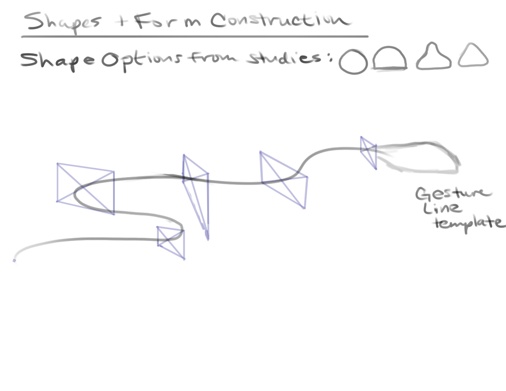
Avoid having pencils (or any other tool) anywhere near your eyes, mouth, nose, and any other sensitive body part or orifice. It’s never a good idea to insert or ingest foreign materials, so if you tend to fidget please get a fidget toy instead of chewing on your pencil!
Working with graphite powder, rather than pencils, can get a little dicey. Powders and dusts always come with inhalation and respiratory risks, so when using graphite powder as a medium be sure to wear a simple mask or face covering and keep your workspace well ventilated. Inhalation of graphite powder can cause irritation to the respiratory tract, coughing, shortness of breath and black sputum.
Long term or chronic exposure to graphite powder has been associated with the development of a lung disease called pneumoconiosis. Ingestion of large amounts of graphite powder may cause gastrointestinal irritation.[1]
Basically, graphite pencils and powder are safe to use and minimally toxic so long as you don’t eat, inhale, or seriously stab yourself with them. Getting a bit of graphite onto your skin while you work won’t harm you at all, but do be sure to wash your hands when you’re done working.
Hey, look! You’re still here, and we’re done! Thank you for hanging in there with me. I know this topic was more technical, but I hope I was able to keep it interesting and answer your questions about graphite pencils, the pencil grading scale, and the safe use of pencils. If you have any questions or feedback, please let me know in the comments below.